Create a Tornado Chart in ExcelLearn how to create a Tornado Chart in Excel


In Excel, you can easily insert a graph or chart with just the click of a button.
This is a really neat feature as charts and graphs are great tools to represent data.
They provide an easy-to-understand visual representation of the data you’re working.
To illustrate my point, take a look at these:
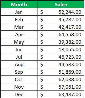
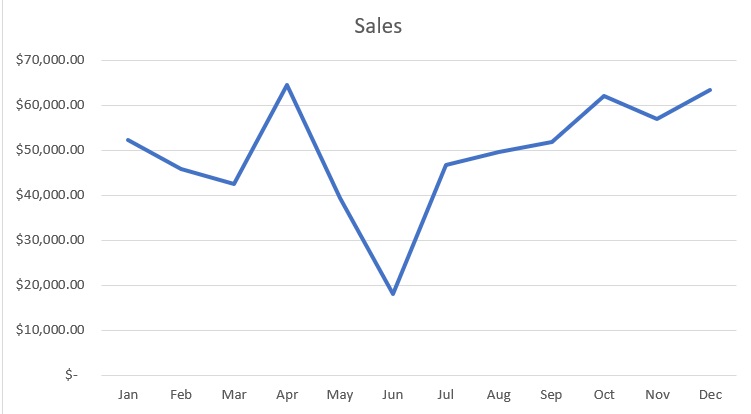
Which of the two is more appealing to look at? I bet that you like looking at the graph more.
But anyways, let’s get to the main topic of this article: the Tornado Chart.
In this article, I’ll be teaching you how to create a tornado chart.
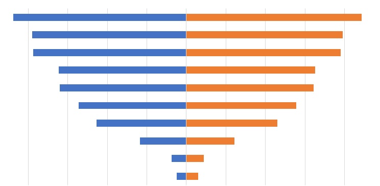
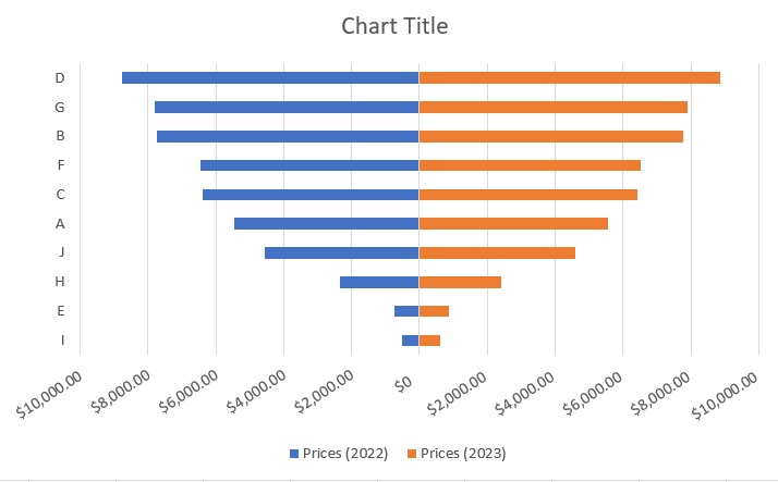
Here’s a sneak peek of what it looks like:
By the end of the article, you’ll know what a tornado chart is and what information it provides.
You’ll also find out why it’s called a tornado chart.
Finally, you’ll learn of the several ways you can create a tornado chart in Excel.
Let’s get started.
What is a Tornado Chart?
A tornado chart is basically a special type of bar chart.
It’s particularly helpful for those who are analyzing their data to make better decisions.
This is because a tornado chart compares two sets of data by converting them into horizontal side-by-side bar graphs.
As such, a tornado chart is really useful for comparison purposes.
That said, it’s best used for sensitivity analysis. Because of the information it provides, you could say that it’s one of those advanced charts.
Creating a tornado chart requires setting up your data.
You’ll need to do so to get the tornado shape.
Speaking of, the reason why a tornado chart is called a tornado chart is… well, it’s shaped like a 2D tornado.
Anyway, with that out of the way, let’s proceed with creating a tornado chart in Excel.
Use Insert Bar Chart to Create a Tornado Chart in Excel
Remember when I said that you can easily insert a graph or chart in Excel with just the click of a button?
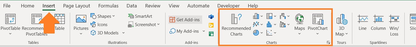
Well, I wasn’t exaggerating with that. And you can do so by clicking any of the buttons here:
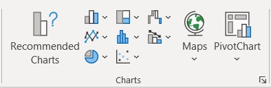
This is the insert chart/graph section of Excel. By clicking any of the icons, you’ll be able to insert a chart/graph.
Each icon represents a particular type of chart/graph.
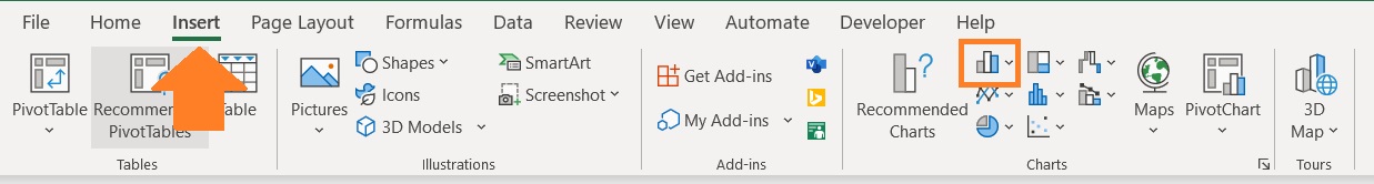
You can access this section by opening the Insert tab. In the center of the ribbon, you should be able to see the insert chart/graph section.
Unfortunately, Excel does not yet have an in-built option to insert a tornado chart.
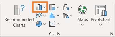
But remember that a tornado chart is a special type of bar chart. As such, we’ll be inserting a bar chart in Excel to create a tornado chart.
Here’s the particular icon you need to click on to insert a bar chart:
Setting Up the Data
Before we can create a chart, we need data. Also, before we can make a tornado chart, we need to set up the data.
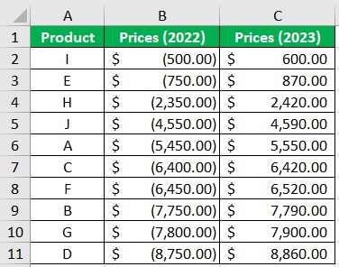
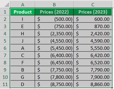
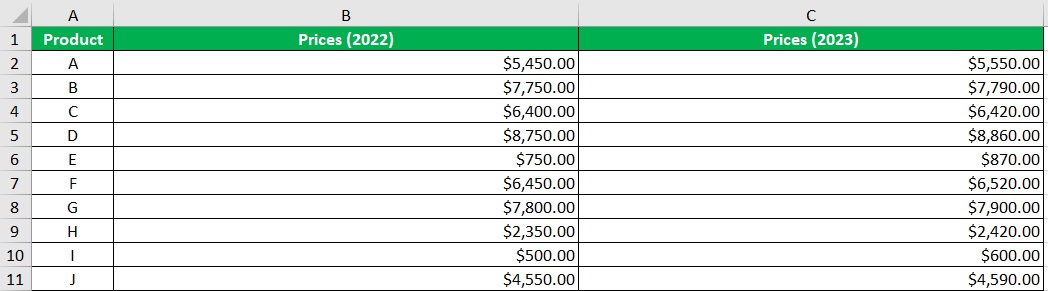
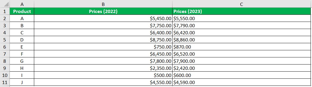
Suppose you’re working with the following data:
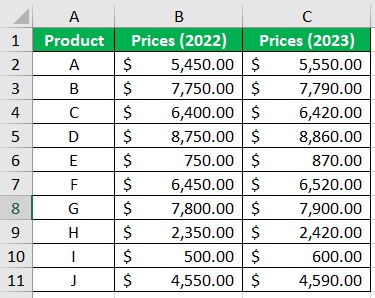
It’s data regarding the prices of particular products in the years 2022 and 2023. Now, what we need to do with this is:
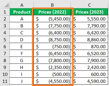
- Convert one of the columns into negative values. This is to make the data bars show in different directions. For illustration, we’ll convert the 2022 column into negative values. (To easily do this, you can use the Paste Special trick)
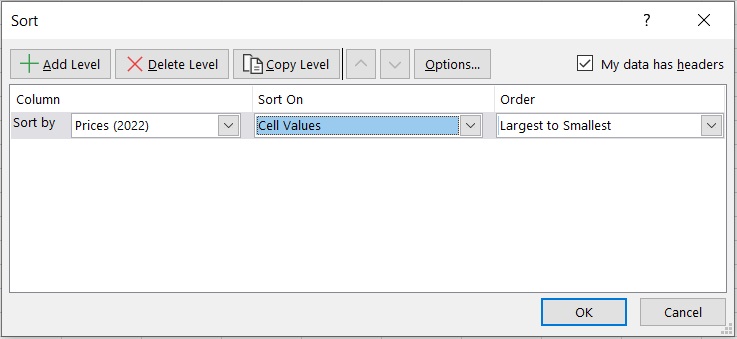
- Next, we’ll have to sort the data in ascending order (smallest to largest) for the positive values or in descending order (largest to smallest). (You can use Excel’s sort feature to arrange the data in ascending or descending order).
And with that, the data is set up. We can now create our tornado chart.
Create a Tornado Chart in Excel
- Select the reference data for the tornado chart.
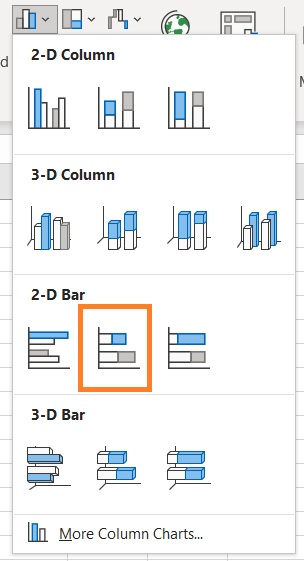
- Open the Insert tab. In the center of the ribbon, you should be able to see the insert chart/graph section. Click on the option to insert a bar chart.
- From the options, select 2D Stacked Bar.
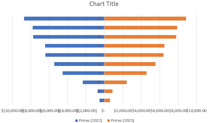
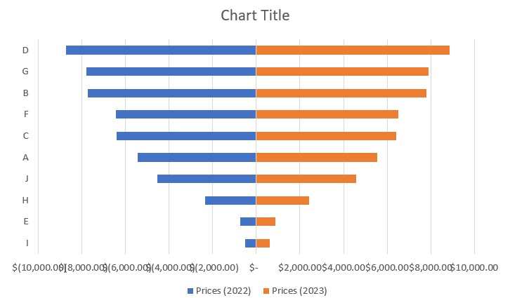
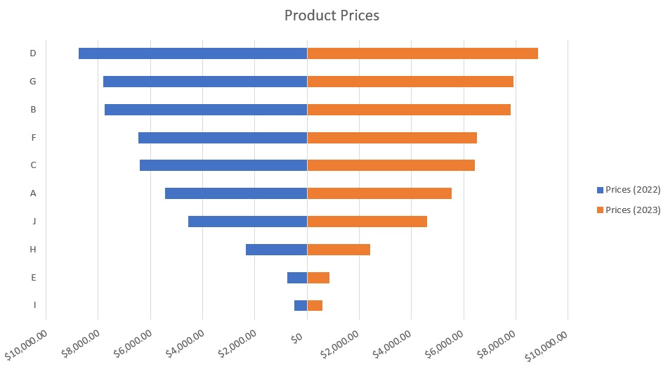
- And with the data that we set up, Excel should insert a Tornado Chart. It’s a little bit rough looking and could use some formatting.
Formatting the Tornado Chart
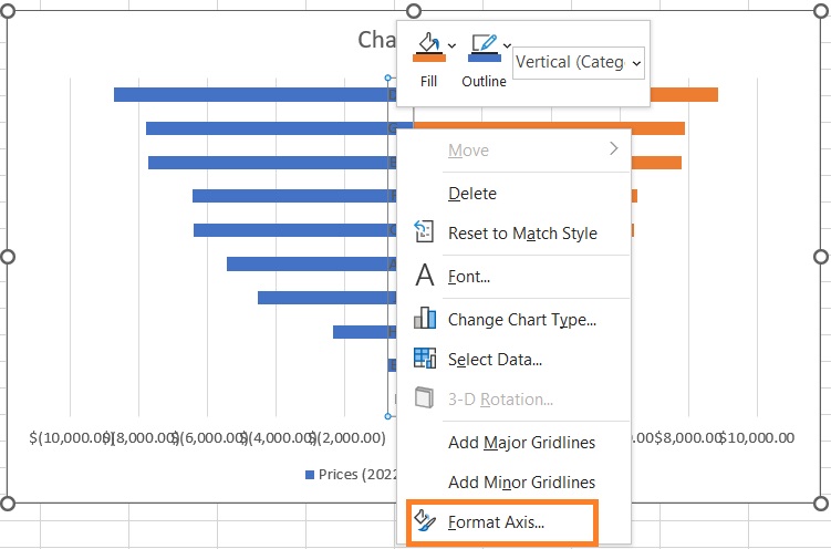
- First, let’s move the y-axis labels to the left. To do so, right-click on any of the y-axis labels and then select Format Axis from among the options. This will open the Format Axis Sidebar.
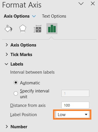
- In the sidebar, go to the Labels section. Then set Label Position to Low. This should move the y-axis labels to the left of the chart.
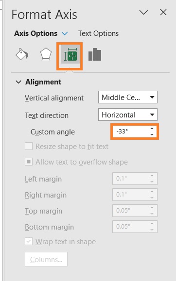
- Next, let’s edit the x-axis labels. As they are, they are hard to read because they’re overlapping. First, right-click on any x-axis label. Then, select Format Axis from among the options. This will open the Format Axis Sidebar.
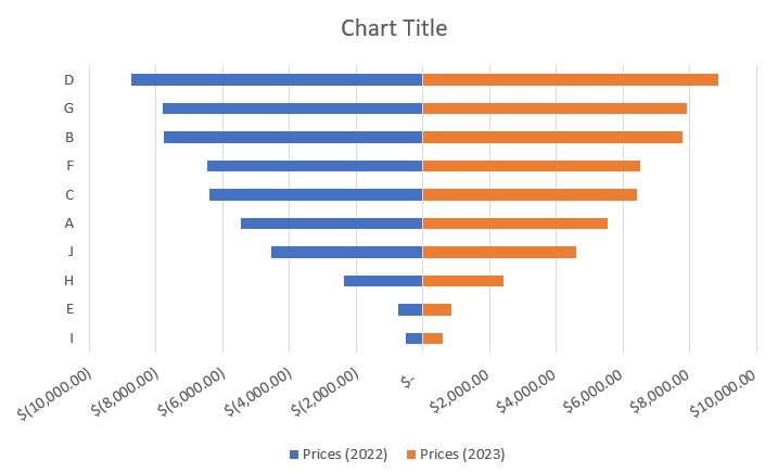
- In the sidebar, go to the Alignment section. Set the custom angle to an appropriate value (in our illustration, this will be -33 degrees). This should make the x-axis more readable.
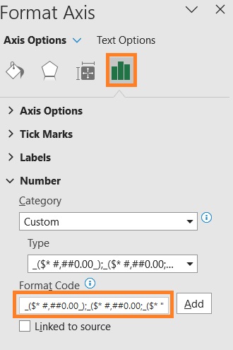
- Let’s also format the labels. In the same Format Axis sidebar, go to the number section. Set the Format Code to _($* #,##0.00_);_($* #,##0.00;_($* “0”??_);_(@_). Press the Add button after doing so. This will make the negative numbers appear as positive values.
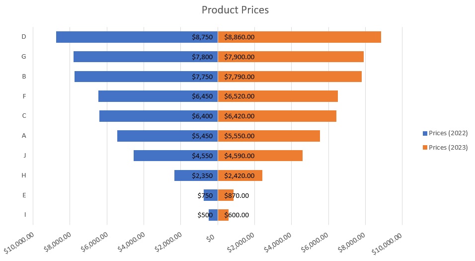
- Finally, let’s move the Legend section to right, and change the Chart Title to “Product Prices”. The Tornado Chart should be much more presentable now.
- [Optional] We can add labels to each bar to make them easier to read.
Use Conditional Formatting to Create a Tornado Chart
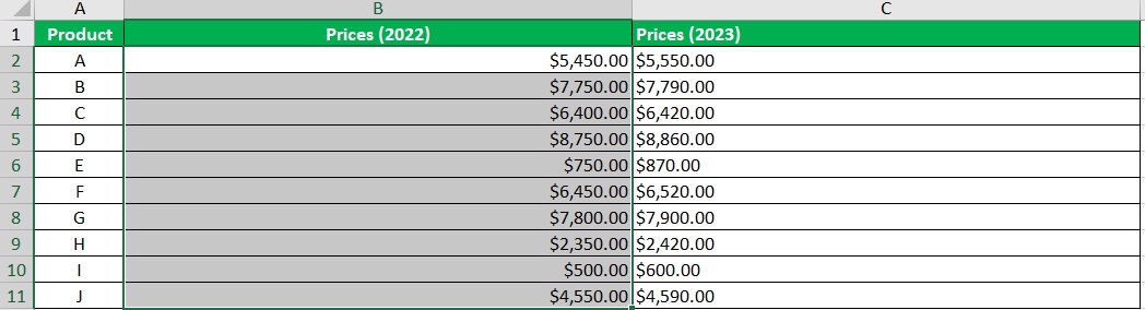
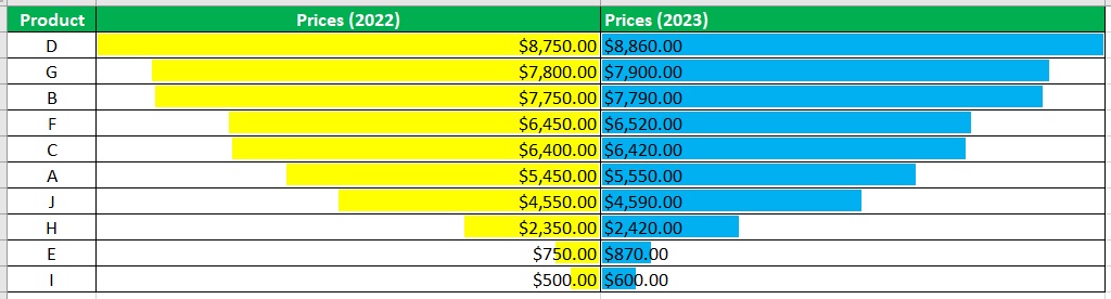
If inserting charts is not your thing but still want to create a tornado chart in Excel, you have another option. And it has to do with conditional formatting. Let’s say that we’re working with the same data:
We want to create a tornado chart with this data. And we’ll do it by using Excel’s Conditional Formatting.
Setting Up the Data
- Format the columns to accommodate the tornado chart. This means increasing the width of the columns that contain the values for the tornado chart. Make them uniform in size.
Next, change the alignment of the cells on the right side of the graph to left. In our illustration, this means changing the alignment of column C to left. (Also, make sure that the left side of the chart is aligned to the right)
Format the Tornado Chart
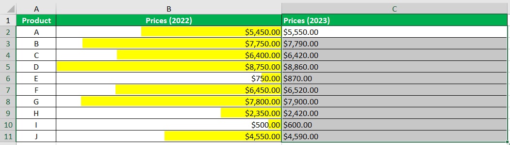
- Now we’ll start applying conditional formatting to each data set. Select the column where the left side of the graph will appear (in our illustration, this will be the Prices (2022) column).
- Then, click the Conditional Formatting button (which can be found in the Home tab). From the options, select Data Bars. Then, select More Rules.
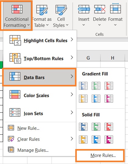
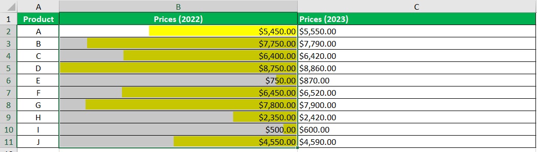
- What we want to do here is set the color (to the preferred color) and the Bar Direction to Right-to-Left. Click the OK button after doing so.

- This should add the bars to the left side of the tornado chart.
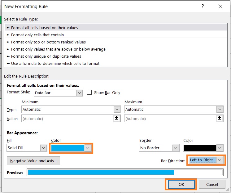
- Next, select the column where the right side of the graph will appear (in our illustration, this will be the Prices (2023) column).
- Then, click the Conditional Formatting button (which can be found in the Home tab). From the options, select Data Bars. Then, select More Rules.
- Again, set the color (to the preferred color). Then, set the Bar Direction to Left-to-Right. Click the OK button after doing so.
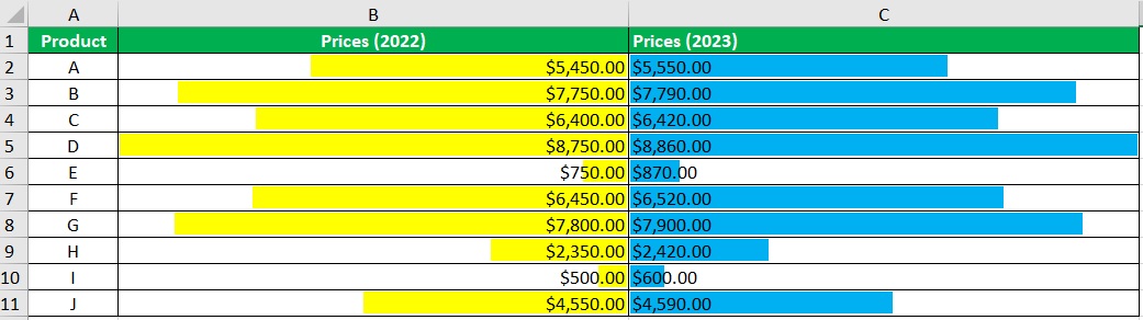
- Both sides of the tornado chart should now have bars.
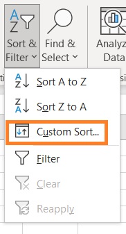
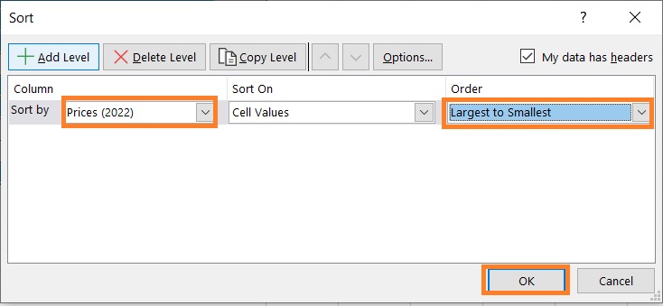
- Lastly, we need to arrange the data to create the tornado shape. Select the dataset.
- Then, click the Sort & Filter button (which can be found in the Home tab). Select Custom Sort from among the options.
- In the Sort dialog box, set Sort By to one of the columns that have bars (e.g. Prices (2022)). Then, set Order to Smallest to Largest. Click the OK button after doing so.
- We should now have our tornado chart.
Conclusion
In this article, I was able to show you two ways to create a tornado chart in Excel.
One involves insert a bar chart, while the other involves creating bars with Excel’s Conditional Formatting.
Which of the two methods do you prefer?
I hope that you’re able to use your learning here in your future endeavors.