Switch the X-Axis and Y-Axis in ExcelHow to switch the axes of an already created chart in Excel


You can do a lot of things in Excel.
Among them is creating charts.
Charts are nifty tools that you can use in your reports.
They present an easy-to-understand visual of the relationship between two factors.
For example, you can present how sales price and sales quantity interact with a chart.
Now if you create a chart, it will typically have two axes: the x-axis and the y-axis.
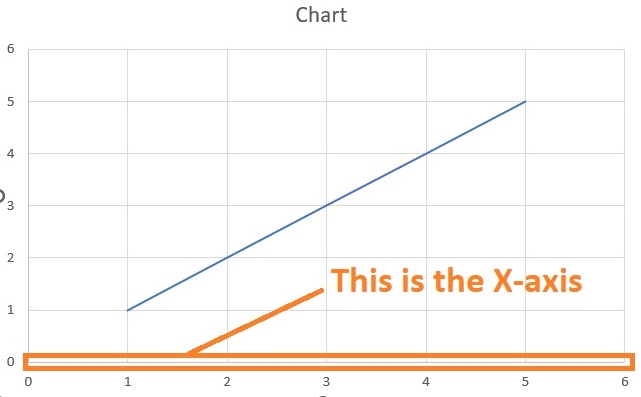
The y-axis is the vertical line of the char.
On the other hand, the x-axis is the horizontal line.

Understanding these two axes (X-axis and Y-axis) is important for presenting the chart properly.
For example, you might want the sales price data on the Y-axis while the sales quantity data goes to the X-axis.
Now, let’s say that you were able to create a chart in Excel.
However, you seem to have mistakenly swapped the X-axis and Y-axis.
You want to swap these two axes back so that the chart is presented properly.
What would you do?
Instinctively, you might delete the chart and then create a new one that presents your data properly.
Which is fine as it does the job. But what if I tell you that there’s a more efficient way to do it?
In this article, you’ll be learning how to switch the X-axis and Y-axis of a chart in Excel.
You’ll also be learning the basics of how to create a chart in Excel.
By the end of the article, you should be able to easily swap the axes of a chart in Excel whenever you want to.
How to Create a Chart in Excel
Before we go with switching the X-axis and Y-axis, let us first know how to create a chart in Excel.
It’s pretty and can be a great tool once you get used to it.
To create a chart in Excel, you will need data.
We will be using this data for our illustration:

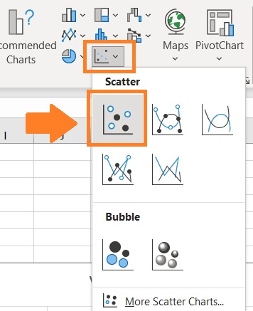
- Select the cells that contain the data that you want to present on the chart. In our illustration, that would be cells B1 to C13.

- Open the Insert tab. You should see a section that includes options to include different types of charts.
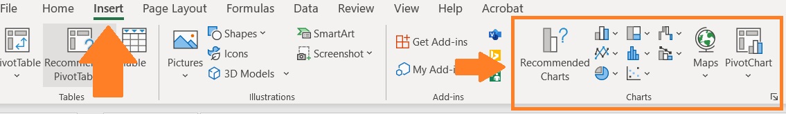
- For now, insert a scatter graph. Do this by clicking the Scatter chart icon. Then select Scatter chart.
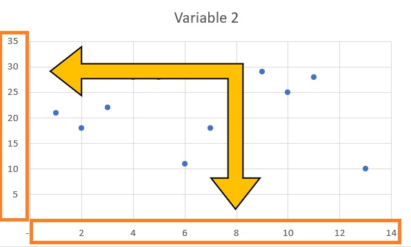
- And you should have your scatter chart.

Things to note when creating a chart
- Excel will automatically assign the first column of the selection as the X-axis.

- The second column will be automatically assigned to the Y-axis. Also, if it has a header, it will be automatically assigned as the chart title.

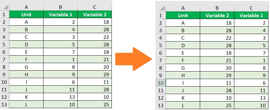
- One way to switch the X-axis and Y-axis of a chart in Excel before creating it is to swap the cells that contain the data. In our illustration, we’ll have to swap cells B1 to B13 with C1 to C13.
Switching the X-axis and Y-axis in Excel
Now let’s say that you already created the chart. However, you noticed the X-axis and Y-axis are assigned incorrectly.
So you want to swap them. Fortunately, you don’t have to delete the chart and make a new one to rectify this mistake.
You only have to follow these steps:
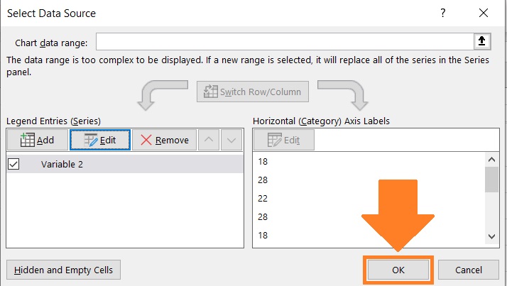
- Right-click on the X-axis or Y-axis of the chart. You may also select the chart and then right-click on it. This will present you with several options. Choose “Select Data”. This will open the Select Data Source dialog box.

- Alternatively, you may select the chart and then open the Chart Design tab. Click the Select Data button.
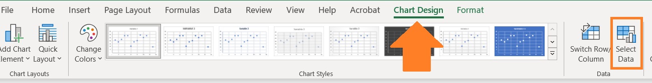
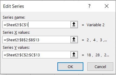
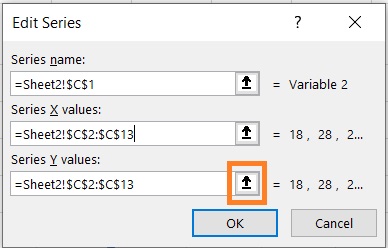
- In the Select Data Source dialog box, you’ll be able to see a lot of data about the chart. What you want to do here is to click the Edit button found on the left side. This will open a pop-up window where you can edit the cell series of the axes.

- In this pop-up window, you’ll be able to see the range of cells for each axis. The text box below “Series X values” will contain the cells that are assigned to the X-axis (which are cells B2 to B13 in our illustration). The text box below “Series Y values” will contain the cells that are assigned to the Y-axis (which are cells C2 to C13 in our illustration). What you want to do here is to swap these values.
Reassign the X-axis
- First, let’s reassign the X-axis. In the textbox below the “Series X values”, type the cells that contain the data that you want to assign to the X-axis. (In our illustration, we will have to type =Sheet2!$C$2:$C$13).
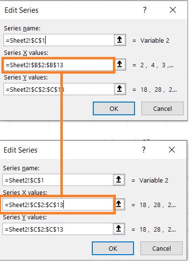
- Alternatively, you may click the button next to the textbox. This will let you select the cells that you want to assign to the X-axis. (In our illustration, we will have to select cells C2 to C:13).


Reassign the Y-axis
- Next, let’s reassign the Y-axis. In the textbox below the “Series Y values”, type the cells that contain the data that you want to assign to the Y-axis. (In our illustration, we will have to type =Sheet2!$B$2:$B$13).

- Alternatively, you may click the button next to the textbox. This will let you select the cells that you want to assign to the Y-axis. (In our illustration, we will have to select cells B2 to B:13).

- Click the Ok button.

- This will take you back to the Select Data Source Dialog box. Click the OK button.
- This should switch the X-axis and Y-axis of the chart.

Conclusion
You don’t have to delete and then create a chart just to switch its X-axis and Y-axis.
Instead, you can edit the X and Y values via the Select Data Source dialog box.
This should allow you to switch the axes of your chart without having to remake it.
I hope this article was able to teach you what you need to know to switch the X-axis and Y-axis in Excel.