Rotate Charts in ExcelBar graph? Column chart? Pie chart? Line chart? Even 3D charts? Learn how to rotate them all
If you want to have a visual representation of your data that’s easy to understand, you may want to convert it into a chart or graph.
I mean, take a look at these two:

The first image is a snap of a dataset. The second image is the same dataset but converted into a column chart. Of the two, which is easier to understand?
Another great thing about charts and graphs is that they’re easy to insert in Excel. You only need to select your data, click on the insert chart/graph button of your choice, and voila, you have your chart/graph.
The thing is, Excel has a default setting for the charts and graphs that it makes.
And chances are, it won’t always work for you. You may want to swap the x- and y- axes. You may want to change the legend position. Or maybe you want to rotate your pie chart. Whichever the case is, you’ll have to modify your chart/graph.
In this article, you’ll be learning how to rotate various types of charts/graphs to your desired setting. Be it a pie chart, a bar graph, a column chart, or even a 3D chart, you’ll be learning how to rotate them all.
Let’s get started.
Rotate a Pie Chart in Excel
Suppose you’re working with a pie chart such as this one:

You don’t like the current layout. You want the larger slices of the pie to appear on the right side rather than the left side. To do so, you’ll have to rotate the pie chart to your desired angle. Here’s how to do so:
How to Rotate a Pie Chart in Excel
- Right-click on any slice of the pie chart. A list of options will appear. Select and click on Format Data Series from among the options.

- The Format Data Series sidebar should now be open. In this sidebar, you’ll want to modify the Angle of first slice. By default, it has a value of 0. You can use the slider to set it to the setting that you want. You can also directly type the desired angle in the textbox. If you want to increase or reduce the angle by 1, you can use the up or down arrows beside the textbox. For our illustration, we’ll be setting it to 214 degrees.

- And there we have it. By rotating the pie chart, we were able to make the larger slices (Sci-Fi and Comedy) appear on the right side.

Reverse the Plotting Order of Categories in a Chart
If you’re working with a chart that has the x- and y- axes (except for a radar chart), you can easily reverse the plotting order of its categories. For example, say that you’re working on this column chart:

Suppose you want the plotting order of the categories to be Fantasy – Sci-fi – Comedy – Romance – Horror- Drama – Action instead. Basically, you want to reverse the plotting order of the categories. To do so, you’ll have to reverse the horizontal axis (a.k.a. x-axis) of the chart. Here are the steps to do so.
How to Reverse the Plotting Order of Categories
- Right-click on the horizontal axis (x-axis) of the chart. A list of options will appear. Select and click on Format Axis from among the options.

- The Format Axis sidebar should now be open. What you need to toggle here is the box beside Categories in reverse order. Make sure to tick/check it.
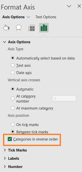
- You have successfully reversed the plotting order of categories in the chart.

How to Invert a Chart in Excel (Reverse the Plotting Order of Values)
Another thing you can do with charts that have the x- and y-axes is inverting them. In other words, you can reverse the plotting order of values in such charts. For example, let’s say you have this column chart:

You want to invert the chart (turn it upside-down). To do so, you’ll have to reverse the vertical axis (a.k.a. y-axis). Here are the steps to do so:
Invert a Chart in Excel
- Right-click on the vertical axis (y-axis) of the chart. A list of options will appear. Select and click on Format Axis from among the options.

- The Format Axis sidebar should now be open. What you need to toggle here is the box beside Values in reverse order. Make sure to tick/check it.

- You have successfully inverted the chart.

How to Change the Legend Position in a Chart in Excel
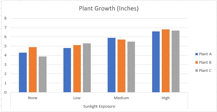
By default, Excel will position a chart/graph’s legend at the bottom. Here’s an example:

This might not always work for you. You might want to relocate its position to the right, left, or top. Here are the steps to do so:
- Right-click on the Legend area. A list of options will appear. Select Format Legend from among the options.

- The Format Legend sidebar should be open now. In this menu, you’ll be able to select the Legend position. For now, select Right.
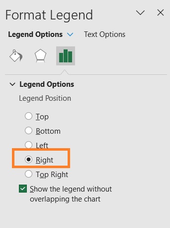
- You have successfully relocated the Legend area in the chart.

How to Reverse the Plotting Order of Data Series in a 3D Chart
The cool thing about 3D charts is that you get a third axis. This allows you to show different data series in different dimensions. Here’s an example:

The Group 1 data series appear in front of the Group 2 data series. But what if you want Group to appear in front instead? To do so, you’ll have to reverse the plotting order of data series in the chart. Here’s how you do it:
Reverse the Plotting Order of Data Series in a 3D Chart
- Right-click on the new axis (Depth axis). A list of options will appear. Select and click on Format Axis from among the options.

- The Format Axis sidebar should now be open. What you need to toggle here is the box beside Series in reverse order. Make sure to tick/check it.
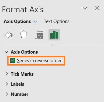
- You have successfully reversed the plotting order of the data series in the chart. The Group 2 data series is now appearing on the front.

Conclusion
And those are the ways you can various charts/graphs in Excel. You should be able to set your charts or graphs to your desired settings now.
