Create a Quadrant Chart in ExcelLearn how to create a quadrant chart in Excel


Excel has this very helpful feature that lets you, the user, create or insert charts in it (particularly, the active sheet).
And this feature is what I’d like to call the “Insert Chart” feature.
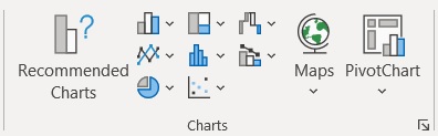
With the click of a button, you can create a chart (of the type of your choice). The default selection of charts that you can insert in an Excel sheet includes the following:
- Column chart
- Bar chart
- Hierarchy chart
- Waterfall chart
- Funnel chart
- Stock chart
- Surface chart
- Radar chart
- Line chart
- Area chart
- Statistic chart
- Combo chart
- Pie chart
- Doughnut chart
- Scatter chart
- Bubble chart
With just the default selection, you already have a lot of choices.
That said, there are still a number of important charts that aren’t included in this selection.
One of these said charts is the quadrant chart, a very useful tool in certain data analyses (such as PEST or SWOT analysis).
Does this mean that you can’t create a quadrant chart in Excel? No, you still can.
It will take a bit more effort than the default chart choices, but you definitely can create a quadrant chart in Excel. And in this article, I’ll be showing you how you can do so.
But first, let’s familiarize ourselves with what a quadrant chart is and what it can tell us.
Quadrant Chart: What is it?
A quadrant chart is essentially a scatter chart with the background divided into four equal sections (which we call the quadrants).
Each quadrant will contain a group of values that fall into one of the distinct categories that the chart user specifies.
For example, you can group a set of values based on four criteria: (1) low cost, high revenue, (2) high cost, high revenue, (3) high cost, low revenue, and (4) low cost and low revenue (which creates a sort of reverse BCG matrix).
You can also use a quadrant in PEST or SWOT analysis.
How to Create a Quadrant in Excel
Now that we know what a quadrant chart is and what it can tell, let’s proceed to make one in Excel.
But before we can make a chart, we need data. As such, we’ll be using this data set to create our sample quadrant chart:

Our aim is to create four quadrants that group the values into these categories:
- Low cost, low revenue
- Low cost, high revenue
- High cost, low revenue; and
- High cost, high revenue
Setting up the quadrant chart
Create an Empty Scatter Chart
We’ll start first by creating a scatter chart that references the above dataset.
We want to base the X-axis on the Cost values. We will then base the Y-axis on the Revenue values.
To ensure that this happens, we’ll have to create an empty scatter chart.
- Open the Insert tab. You should see a Charts section somewhere in the middle of the ribbon.
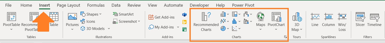
- Click on the “Insert Scatter or Bubble Chart” button. Then, among the options, select the one that inserts a scatter graph.

Add X- and Y-axis values
This should insert an empty chart. It’s time to fill it in with data
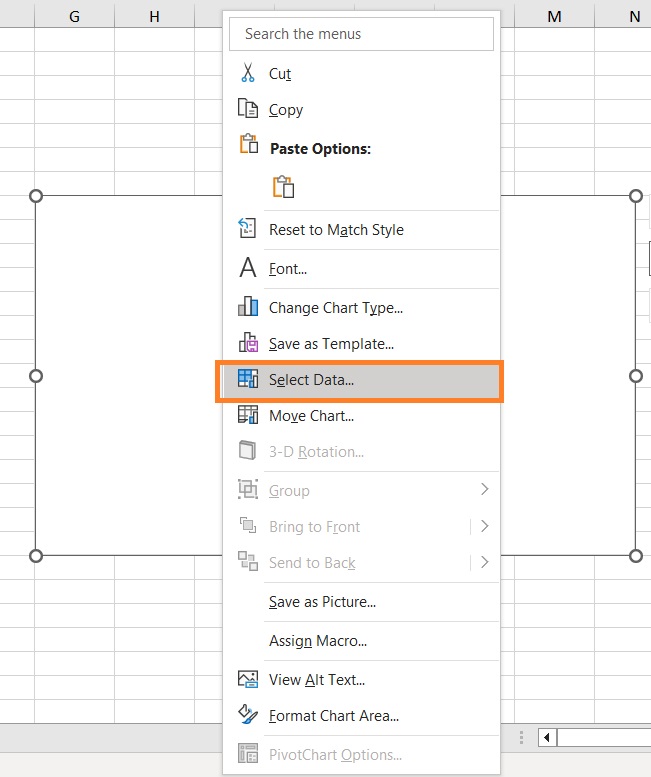
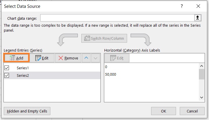
- Right-click anywhere on the chart. Then from the options, select “Select Data”.
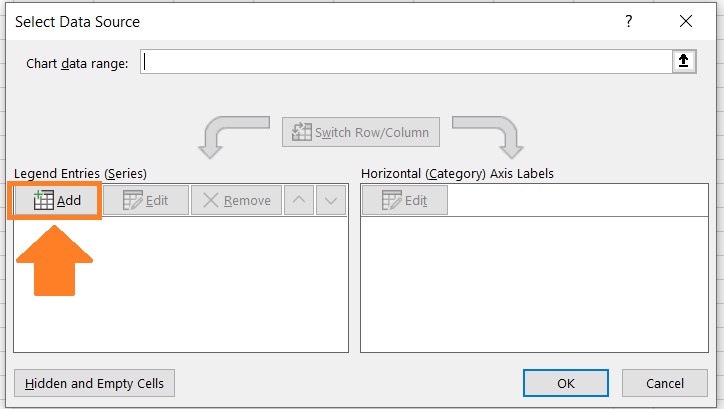
- The “Select Data Source” dialog box should appear. In this dialog box, click the Add button under “Legend Entries (Series). This will let us set the X- and Y-axes.
- For the Series X values, enter the range of cells that contain the Cost values (B2:B13). We can click the UP arrow button in its textbox, then select the range of cells with your mouse. For the Series Y values, enter the range of cells that contain the Cost values (C2:C13). We can also click the UP arrow button in its textbox, then select the range of cells with your mouse. Click the OK button after doing so.
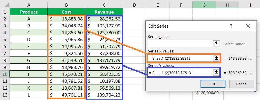
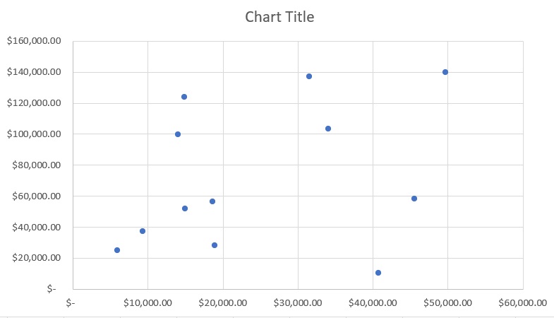
- This will return us to the Select Data Source” dialog box. Click the OK button. We should now have our base scatter chart.
Edit the scatter chart
Next, we’ll make some edits to the chart before we convert it into a quadrant chart.
- Let’s delete the gridlines. To do so, right-click on any of the horizontal gridlines, then select “Delete”. Do the same to any of the vertical gridlines.
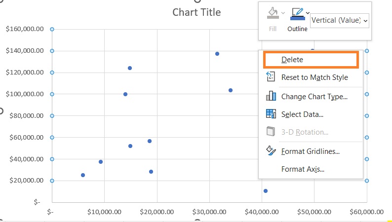
- The chart should no longer show gridlines.

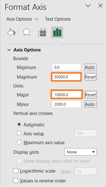
- Next, we’ll edit the minimum and maximum bound of the X- and Y-axes. Let’s start first with the X-axis. Right-click on any of the X-axis labels. Then from the list of options, select “Format Axis”.
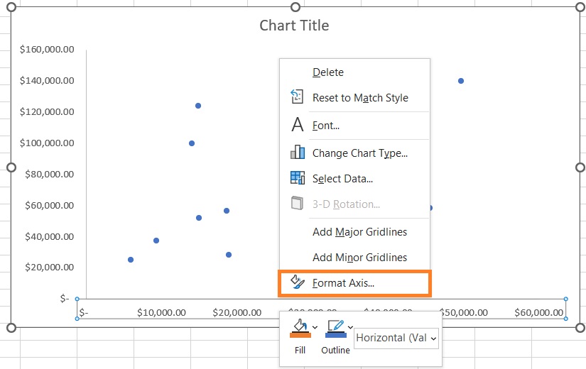
- This should open the Format Axis sidebar with the Axis Options open. In this sidebar, we’ll set the Maximum Bounds to 50,000. We’ll leave the Minimum Bounds at 0. To not crowd the X-axis labels, we’ll set the Major Units to 10,000.
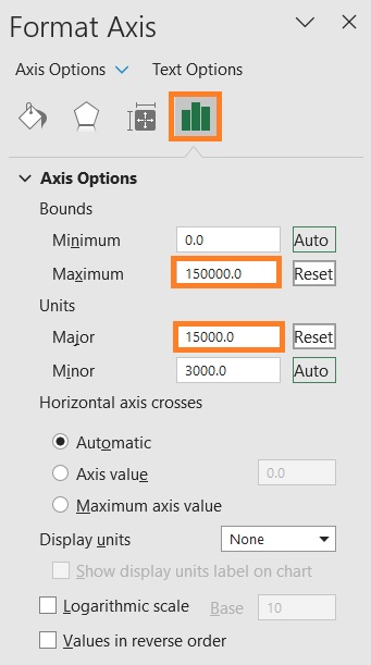
- Next, we’ll edit the minimum and maximum bound of the Y-axis. With the Format Axis sidebar still open, click on any of the Y-axis labels. Then, open Axis Options. Set the Maximum Bound to 150,000. We’ll leave the Minimum Bounds at 0. To not crowd the Y-axis labels, we’ll set the Major Units to 15,000.
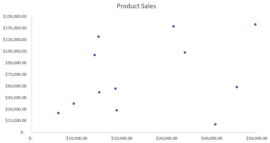
- Finally, we’ll change the chart title to Product Sales. To do so, just double-click on the Chart Title box and enter our preferred chart title (Product Sales).
- Our scatter chart is now ready to be converted to a quadrant chart.
Creating the Quadrant Chart
Create a table for the quadrant lines
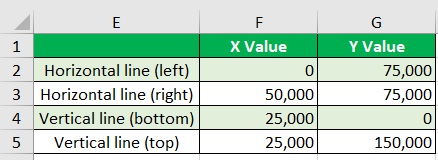
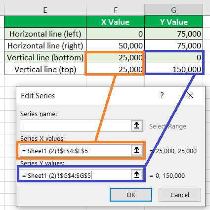
It’s time to insert the quadrant lines. To do so, we’ll create a table that will include the quadrant line values. We’ll set up the table like this:
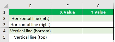
- For the Horizontal line (left), set the X value to zero (0). Then for the Y value, set it to the average value of the minimum and maximum bounds value of the Y-axis ((150,000 + 0)/2) which is 75,000.
- For the Horizontal line (right), set the X value to the maximum bounds value of the X-axis (50,000). Then for the Y value, set it to the average value of the minimum and maximum bounds values of the Y-axis ((150,000 + 0)/2) which is 75,000.
- For the Vertical line (left), set the X value to the average value of the minimum and maximum bounds values of the X-axis ((50,000 + 0)/2) which is 25,000. Then set the Y value to zero (0).
- For the Vertical line (left), set the X value to the average value of the minimum and maximum bounds values of the X-axis ((50,000 + 0)/2) which is 25,000. Then set the Y value to the maximum bounds value of the Y axis (150,000).
- Here’s how the table should look now:
Adding the Quadrant Lines
Now that we have our table for the quadrant lines, it’s time to add them.
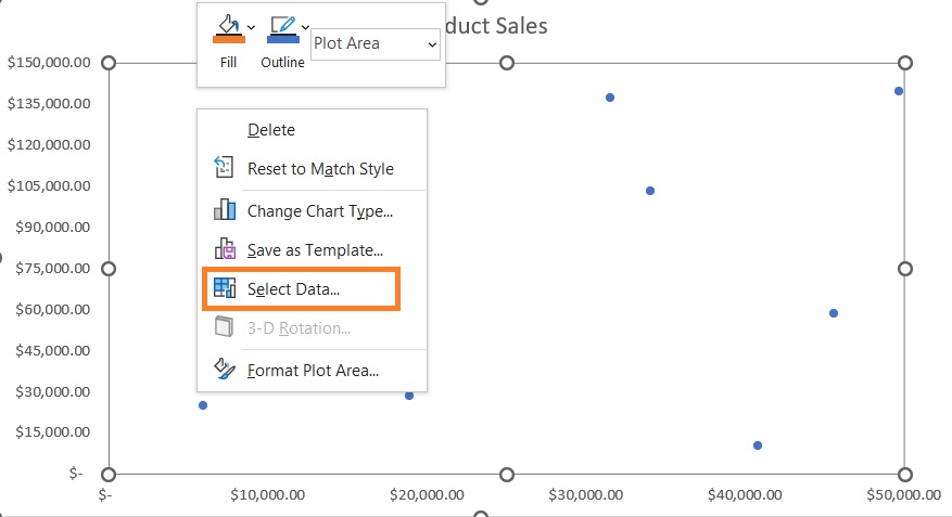
- We’ll first add the horizontal quadrant line. Right-click anywhere on the chart. Then among the options, select “Select Data”.
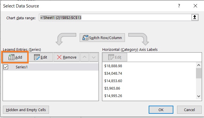
- In the Select Data Source dialog box, click the Add button that is below “Legend Entries (Series)”.
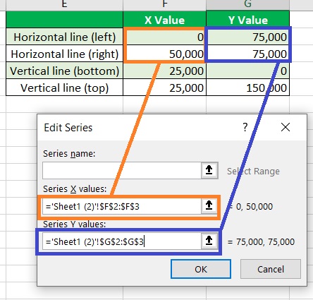
- Set the Series X values to the X values of the horizontal line (F2:F3). Set the Series Y values to the Y values of the horizontal line (G2:G3) Click the OK button after doing so.
- Next, we’ll add the vertical quadrant line. With the Select Data Source dialog box open, click the add button.
- Set the Series X values to the X values of the vertical line (F4:F5). Set the Series Y values to the Y values of the vertical line (G4:G5) Click the OK button after doing so.
- Click the OK button in the Select Data Source dialog box. The plots for the quadrant lines should now show on the chart.

- Right-click on any of the data points in the chart. Select “Change Series Chart Type” from among the options.
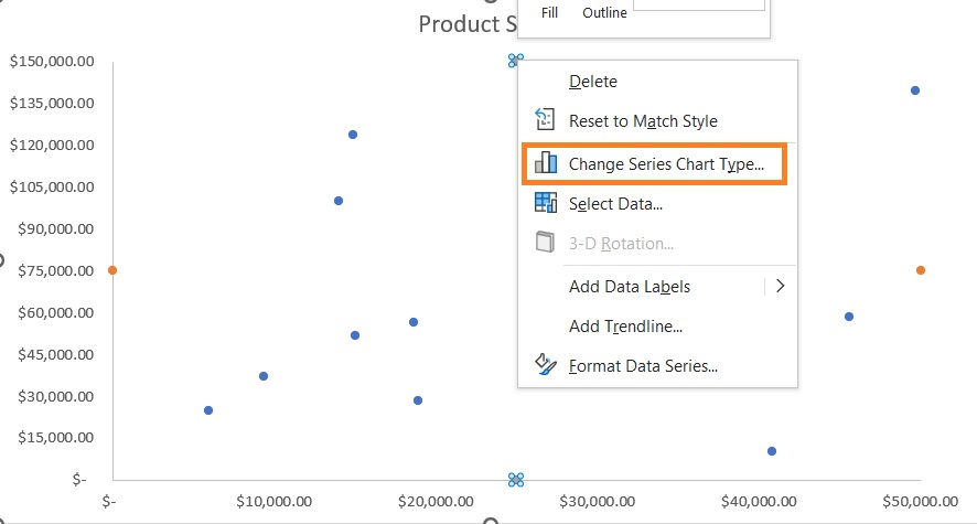
- In the Change Chart Type window, change the chart type of Series 2 and 3 to “Scatter with Smooth Lines. Click the OK button after doing so.
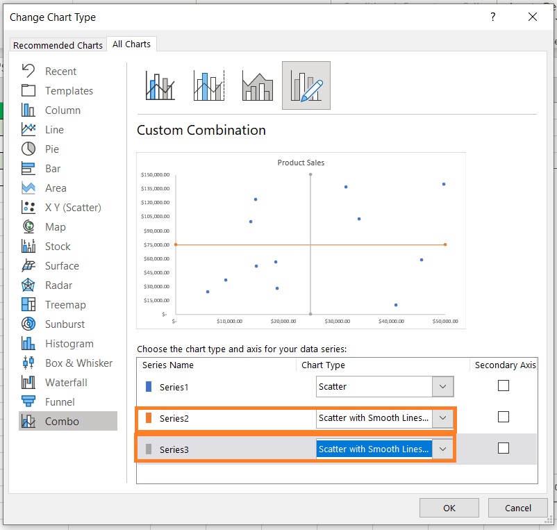
- We have successfully created a quadrant chart.

Edit the Quadrant Chart
There are still some things we can do to make the chart more presentable:
- Edit the quadrant line (make them uniform in color and width)
- Remove quadrant line markers (data points)
- Add data labels
- Edit data label colors
- Add axis titles
Here’s how the quadrant chart looked like after I made some edits:

Conclusion
While creating a quadrant chart in Excel isn’t as intuitive as creating one of the default chart options, it’s still doable.
It requires a bit more effort, but it can be done.
Hopefully, the Excel team will add the option to create a quadrant chart in the future.
Until then, this method should suffice.