Create an Ogive Graph in ExcelLearn how to create an Ogive graph in Excel
One of the many things that you can do in Excel is create graphs and charts. It’s made easy too.
You can insert the chart/graph type that you want with just the click of a button. You’d still have to prepare the data though.
Now, while the Insert Graph/Chart function of Excel gives you tons of options for graph/chart types, there are still some that aren’t inherently included.
That’s not to say that you can’t insert said charts in Excel.
You just need to lay the groundwork (i.e. prep the data) and you should be able to insert said graphs/charts in Excel.
One example of said graphs/charts is the Ogive graph.
Currently, inserting an Ogive graph isn’t a default option in Excel. However, you can still insert one if you have prepared the data for it.
In this article, I’ll be showing how to create an Ogive Graph in Excel.
It may not be as quick and easy as just clicking a button, but it isn’t really that complicated.
Let’s get started.
What is an Ogive Graph?
While the name may intimidate you, an Ogive graph is actually a simple graph.
It is one of the frequency distribution charts. It plots the cumulative frequency of a dataset based on fixed intervals (class limits).
Typically, you can see how many values from the dataset lie above or below the stated class limits.
There are two types of Ogive graphs that you can create: the (1) Less than Ogive graph and the (2) More than Ogive graph.

Example of a “Less than Ogive graph”
The Less than Ogive Graph will always show a curve that is positively increasing (upward slope).
Each of the points in the curve shows the cumulative frequency of values that are less than or equal to the upper limit of each class.
Such as in the example Ogive graph above, there are approximately 19 values that are less than or equal to the upper limit value of 25.

Example of a “More than Ogive graph”
On the other hand, the More than Ogive graph will always show a curve that is negatively decreasing (downward slope).
Each of the points in the curve shows the cumulative frequency of values that are more than or equal to the lower limit of each class.
In the example above, we can tell that there are approximately 13 values that are more than or equal to the lower value limit of 16.
Create an Ogive Graph in Excel: Preparing the Data
The first step to creating an Ogive graph in Excel is the preparation of data.
To create an Ogive graph, we need to divide the dataset into classes, stating the lower and upper limits of each class.
Then, we need to find the frequency of values that belong to each class.
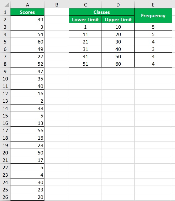
For example, let’s say we have this dataset:

It contains a list of scores that participants earned in a game. The lowest score that a participant can earn is 1 and the highest is 60. We’ll be dividing the scores based on that.
Let’s say that we’ll be dividing the dataset into classes with fixed intervals of 10. The classes should then look like this:

Now that we have our classes, let’s find out the frequency of values for each class. To do so, we’ll be using the COUNTIFS function.
In the adjacent empty cell of the first class, enter the formula:
=COUNTIFS($A$2:$A$26,”>=”&C3,$A$2:$A$26,”<=”&D3)

This formula will count the number of values within the dataset that are more than or equal to 1 and less than or equal to 10 (which are the lower and upper limits of the first class).
We make an absolute reference to the range of cells so that when we copy and paste the formula, the range doesn’t change.
Copy and paste the formula to the rest of the classes so we can find the frequency of values.

The data is ready. We can now create an Ogive graph in Excel.
Create a Less Than Ogive Graph in Excel
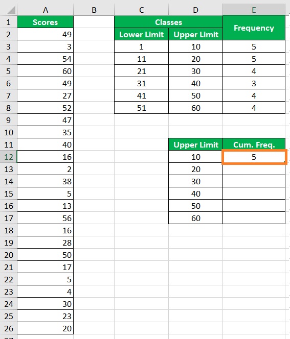
To create a Less than Ogive graph, we will need two sets of variables: the (1) upper limit of each class and the (2) cumulative frequency that starts from the class with the lowest value.

To get the cumulative frequency of each class, we only need to add the cumulative frequency of the previous class with the frequency of the current class.
For the first class, since there is no previous class, we only need to get its frequency.

For the second and so on classes, we only need to add the cumulative frequency of the previous class with the frequency of the current class.

It’s time to create the Ogive graph. Select the cells that contain the Upper Limit and Cumulative frequency values.

With the cells selected, open the Insert tab. You should see a section that gives you the option to insert a graph/chart.

Choose the option to insert a scatter graph with straight lines and markers.

This should create the Less than Ogive graph.

Let’s customize the Ogive graph to make it aesthetically pleasing (add data labels, axes labels, and the chart title).

We have successfully created a Less than Ogive graph in Excel.
Create a More Than Ogive Graph in Excel
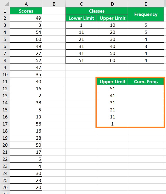
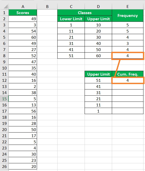
To create a More than Ogive graph, we will need two sets of variables: the (1) lower limit of each class and the (2) cumulative frequency that starts from the class with the highest value

To get the cumulative frequency of each class, we only need to add the cumulative frequency of the previous class with the frequency of the current class.
For the first class, since there is no previous class, we only need to get its frequency.

For the second and so on classes, we only need to add the cumulative frequency of the previous class with the frequency of the current class.

It’s time to create the Ogive graph. Select the cells that contain the Lower Limit and Cumulative frequency values.

With the cells selected, open the Insert tab. You should see a section that gives you the option to insert a graph/chart.

Choose the option to insert a scatter graph with straight lines and markers.

This should create the More than Ogive graph.

Let’s customize the Ogive graph to make it aesthetically pleasing (add data labels, axes labels, and the chart title).

We have successfully created a More than Ogive graph in Excel.
Conclusion
While inserting an Ogive graph isn’t a default option in Excel, you can still create one with a bit of data preparation.
In this article, I was able to show you how to do just that.
I hope you’ll be able to use your learnings here in your future endeavors.
