How to Make a Box Plot (Box and Whisker Chart) in ExcelWhat is a box plot and how can we create one in Excel?


You can make a variety of charts in Excel.
There’s the option to make a scatter graph, bar graph, line graph, etc.
One of the offerings of the latest version of Excel (i.e. Excel 2016 and beyond) is the option to make a box plot.
Well, it’s not like you can’t create a box plot in the older versions of Excel.
You can, but it will take a lot of work (unlike with the newer version which only takes a few clicks).
So why would you want to make a box plot in Excel?
Well, for one, box plots are great tools that provide a way to summarize a dataset.
They also provide insights into the distribution of the data such as the minimum value, maximum value, median, etc.
Box plots are very convenient if you want to analyze the distribution of values in a dataset (such as the distribution of salaries).
In this article, we will be discussing how to make a box plot (a.k.a. box and whisker chart) in Excel.
But before that, you must first understand what a box plot is.
Why would you want to create one?
And how do you interpret the results of a box plot?
If you understand what a box plot is, creating one becomes easier.
Let’s get started!
What is a Box Plot?
A box plot (a.k.a. box and whisker chart) is a chart that is often used in statistical analysis.
It aims to provide a visual summary of the distribution of values in a set of data.
It essentially is divided into 4 parts (a.k.a. quartiles):
- First quartile
- Second quartile (which is the median)
- Third quartile; and
- Whiskers (which depict the minimum and maximum values that are outside the first and third quartiles)

The Box
The main box is drawn from three components: the first quartile, the second quartile, and the third quartile.
The first quartile represents the median of the lower half of the dataset.
On the other hand, the third quartile represents the median of the higher half of the dataset.
Lastly, the second quartile represents the median of the whole dataset.
You’d also notice that there is an X mark in the box. This represents the mean of the dataset.
It’s not a necessary component of a box plot but it’s neat that Excel includes it.
The Whiskers
The lines that you see outside the main box are what we refer to as whiskers.
The top whisker represents the distance of the dataset’s maximum value from the third quartile.
At its very end is the maximum value.
On the other hand, the bottom whisker represents the distance of the dataset’s minimum value from the first quartile.
Similar to the top whisker, the bottom’s very end represents the minimum value.
The longer a whisker is, the farther the maximum or minimum value is from the median.
If a whisker is too long, it may indicate that there is an outlier/s in the dataset. In some very rare cases, a box plot may not have whiskers.
If the whiskers are the same length, the box will be located in the middle.
This also means that the dataset is symmetrical.
Why Create a Box Plot?
A box plot is a very useful tool when you want to compare different sample distributions.
It’s especially useful when you’re studying very large datasets. It provides an easy-to-understand visual of the dataset’s distribution.
It also does this by using five (5) descriptive indicators: the minimum value, maximum value, first quartile, second quartile (median), and third quartile.
A box plot is helpful in confirming whether the dataset is symmetric or skewed.
It can also provide indicators of whether or not there are outliers within the dataset.
That said, a box plot has its limitation. It’s very good at representing bell-shaped or Gaussian distributions, but it can hide important insights in the case of bimodal or other non-Gaussian distributions. Also, interpreting a box plot requires a bit of know-how.
If you’re not already familiar with its components, you may find it hard to understand what a box plot represents.
How to Create a Box Plot in Excel
Now that we know the basics of a box plot, let’s now learn how to create a box plot in Excel.
Do note that the following steps will only work in the later versions of Excel (Excel 2016 and beyond).
If you’re using an older version of Excel, scroll further down for the applicable set of instructions.
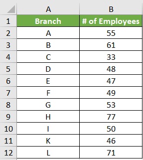
Before we create a box plot, we will need data.
We’ll be using the following data for illustration purposes:
Now that we have our data, let’s proceed with creating a box plot
Create a Box Plot in Excel (For Versions 2016 and Up)
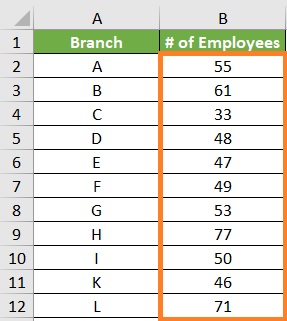
- Select the range of cells that contain the data that you want to include in the box plot. In our illustration, it will be cells B2 to B12.
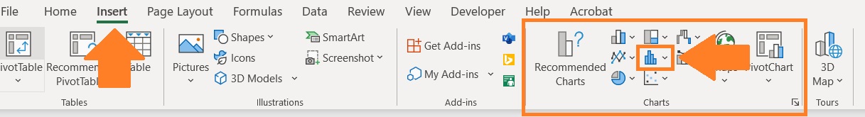
- Open the Insert tab. You should find a section that includes buttons to insert different kinds of charts. Click the “Insert Statistic Chart” button (use the image below as a reference).
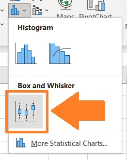
- This will show you several statistical chart options. Choose the Box and Whisker option.
- This should result in the creation of a box plot. We’re not done yet though.
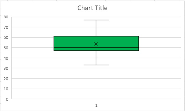
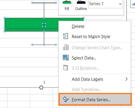
- By default, Excel will create the box plot by performing quartile calculations with an exclusive median. To convert it into an inclusive median, right-click on any of the components of the box plot. This will present you with options. Choose the Format Data Series option. This will open the Format Data Series sidebar.
- In this sidebar, be sure to tick the circle before “Inclusive median”.
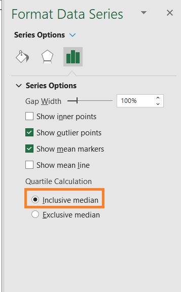
- Your box plot will now be using an inclusive median. If there’s an outlier in the dataset, it will be represented by a dot.

And that’s it. Quick and easy, right?
You may now edit your box plot as you like (e.g. insert data labels, edit the chart title, etc.).
Create a Box Plot in Excel (For Versions Older Than Version 2016)
Creating a box plot in older versions of Excel requires a lot more work.
To make the process more digestible, we will be dividing it into four sections:
- Calculate the 5 summary descriptors from the dataset
- Calculate the quartile differences
- Create a stacked column chart (using the previously calculated values)
- Convert the stacked column chart into a box plot
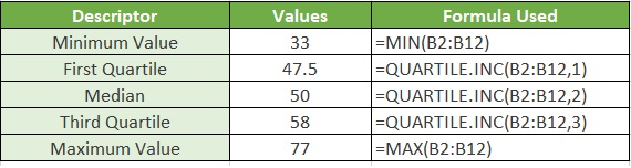
For illustration, we will be using this data:
Calculate the 5 summary descriptors from the dataset
To calculate the 5 summary descriptors (the minimum value, maximum value, first quartile, second quartile (median), and third quartile), you’ll have to use the following formulae:
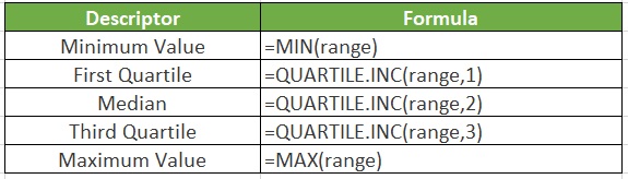
(range represents the range of cells that contain that you want to contain in the box plot)
In our illustration, our range is B2:B12. Calculate the 5 summary descriptors using the above formulae:
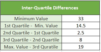
Calculate the quartile differences
Now that you have your 5 summary indicators, you can calculate the quartile differences.
To make it easier, create a table.
- In the first row, insert the minimum value(s) of the dataset. You can also refer to the cell that contains that minimum value. (For our example, it will be cell E4)
- In the second row, insert the difference between the first quartile and the minimum value. (For our example, the formula will be =E5-E4)
- In the third row, insert the difference between the second quartile (median) and the first quartile. (For our example, the formula will be =E6-E5)
- In the fourth row, insert the difference between the third quartile and the second quartile (median). (For our example, the formula will be =E7-E6)
- In the fifth row, insert the difference between the maximum value and the third quartile. (For our example, the formula will be =E8-E7)
Here’s the result using our example:
Create a stacked column chart (using the previously calculated values)
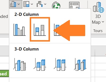
Using the quartile differences that you just calculated, create a stacked column chart.
- Select the range of cells that contain the quartile differences. (For our example, that will be cells E12 to E16)
- Open the Insert tab. From the selection of charts, choose the Column chart option (use the image below as a reference).

- This will present you with several column chart types. Select “Stacked column” from the 2-D column category.
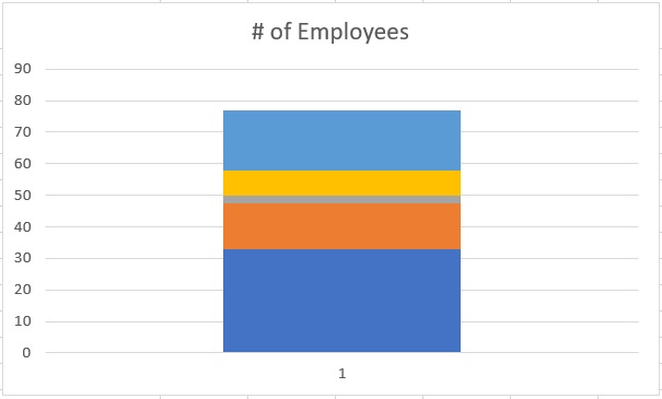
- Your stacked column chart will then be created. However, this does resemble a box plot yet. We have to swap the rows and columns to make it look more like a box plot.
- To do so, right-click on the chart and click on “Select data”.
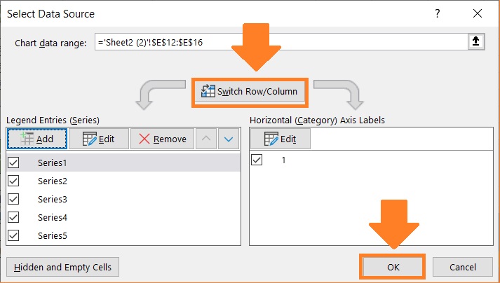
- This will open the Select Data Source Dialog box. Click the Switch Row/Column button located in the middle. Then, click the OK button.
- Finally, we have a stacked column chart that resembles a box plot. You can now edit the title and labels as you want.
Convert the stacked column chart into a box plot
Now that you have your stacked column chart, it’s time to convert it into a box plot.
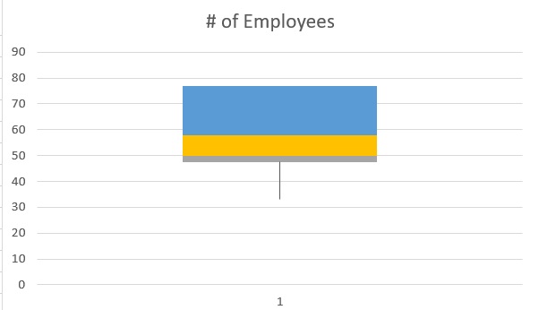
- Select the lowest segment of the chart.
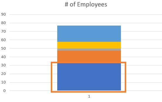
- Format this segment so that it doesn’t have a background. Basically, you want this segment to disappear.
Create the Whiskers
- First, create the bottom whisker. Select the second bottom segment of the chart.
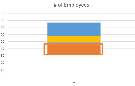
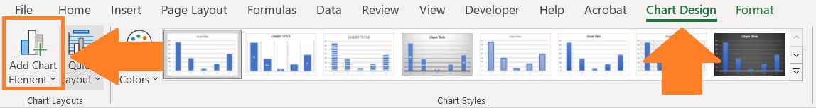
- Open the Design/Chart Design tab and click the Add Chart Element button.
- Select the Error Bars option, then select Standard Deviation.
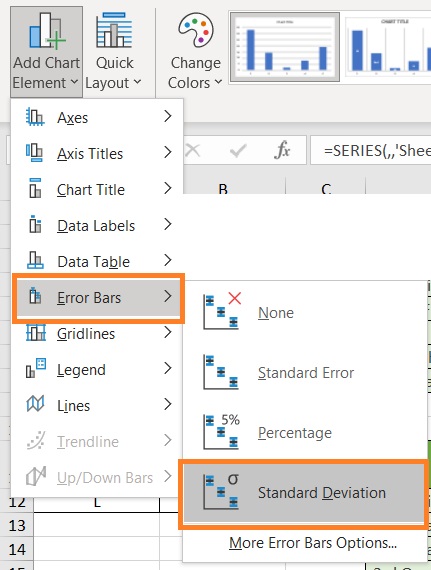
- This will add error bars to the chart. Right-click on the error bar. This should open the Format Error bars sidebar. Set it as follows:
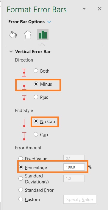
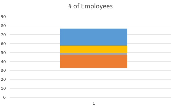
- Remove the fill from the second bottom segment. This should create the bottom whisker of the box plot.
- Do the same steps to the topmost segment to create the top whisker.
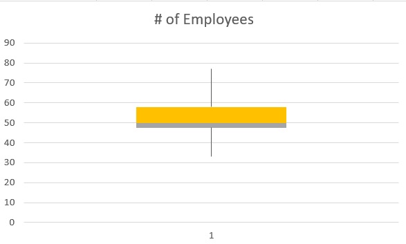
Create the box
- Select the remaining segments (third and fourth from the bottom). Format them so that they have the same fill color as well as borders. You can do this by selecting the segment and then editing the fill and border from the Format Data Series sidebar.
- After making the edits, you will have your box plot.
Conclusion
And there we have it. You should be able to make a plot box in whatever version of Excel.
Admittedly though, it requires less effort to make in the newer versions of Excel.
Creating a box plot in the older versions of Excel requires a lot more effort.