Creating a Scatter Plot in Google SheetsStep-by-Step Guide with Screenshots & More!
Google Sheets features a built-in function for creating scatter plots, which are a useful way to display trends and connections in data that other graph types may not effectively convey.
Scatter plots are a useful tool for displaying trends and patterns in data that are dispersed.
They are particularly effective for highlighting clusters of data points, which are not as easily visible in bar or line charts.
It also allows for the inclusion of trendlines, which further illustrate the relationship between the different data points.
The Error Bars can also be utilized to identify outliers and show the extent to which they differ from the rest of the data.
In this tutorial, we will use a sample dataset of 50 buildings for sale, with the asking price as one of the variables.
A portion of the data is provided below for reference.

The columns we will be using for this tutorial are ‘sq ft’ (square feet) representing the square footage of the lot, and ‘Price in $’ representing the asking price.
Using this data, let us proceed with the tutorial to create Scatter Plots in Google Sheets.
Creating a Scatter Plot in Google Sheets
Google Sheets has a built-in option to create scatter plots, which can be easily applied to various data sets.
The process of creating a scatter plot is straightforward and requires minimal setup.
When the dataset appears scattered, a scatter plot is often a better choice than a bar or line chart.
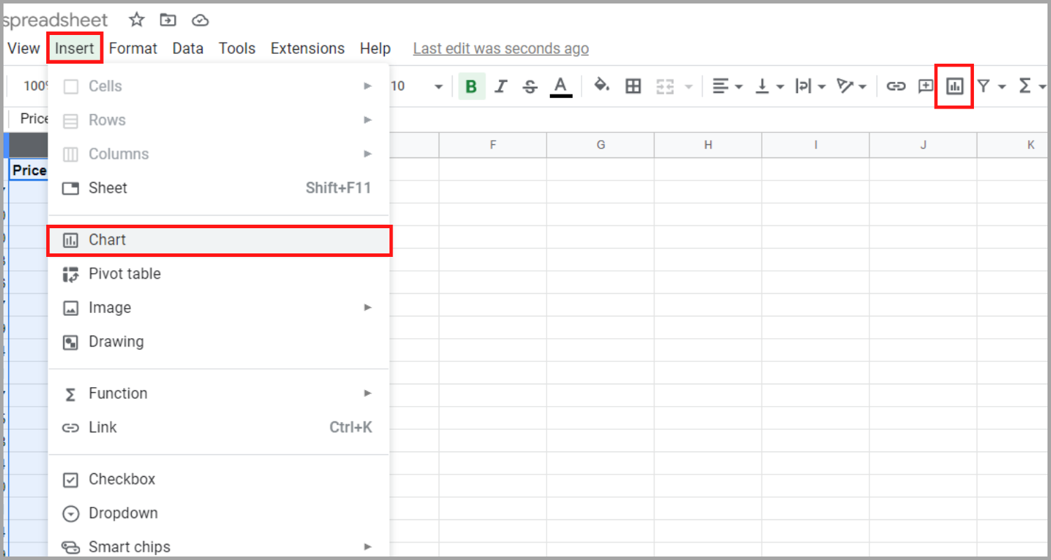
The steps below will guide you in creating a Scatter Plot in Google Sheets:
- Select the columns to be compared by holding the shift key and clicking on the column names.

- Clicking “Insert” and “Chart” (left) or click the “Chart” icon from the top submenu (right) to access the “Chart editor”.

- In the “Chart editor”, choose “Scatter chart” under “Chart type” to create the scatter chart. You have successfully created your data’s scatter plot chart.

While the scatter plot chart provides valuable information, Google Sheets also offers more features to further help you in your data analysis.
Creating a Trendline for a Google Sheets Scatter Plot
Incorporating a trendline into a scatter plot in Google Sheets is an effective way to show data trends. Thankfully, Google Sheets offers an easy method for your chart to have this feature.
The steps below will guide you on how to add a trendline to a scatter plot in Google Sheets:
- By selecting “Edit chart” from the pop-up menu after clicking the three dots icon at the upper right of the graph, the chart editor for your scatter plot will be opened.

- Under the “Customize” tab, the “Series” section will be expanded by clicking on the arrow-down icon. Check the box next to “Trendline” to add the feature to your chart.

- By following these steps, your scatter plot graph will display a trendline showing the overall relationship between coordinate values X and Y.

Using Error Bars to a Scatter Plot
Error bars are a valuable feature on scatter plot graphs for showing the reliability or consistency of a particular data point. By using error bars in the example of retail space cost, it can aid a potential buyer in avoiding overpriced locations.
Here are the steps for adding error bars to the scatter plot:
- By selecting “Edit chart” from the pop-up menu after clicking the three dots icon at the upper right of the graph, the chart editor for your scatter plot will be opened.

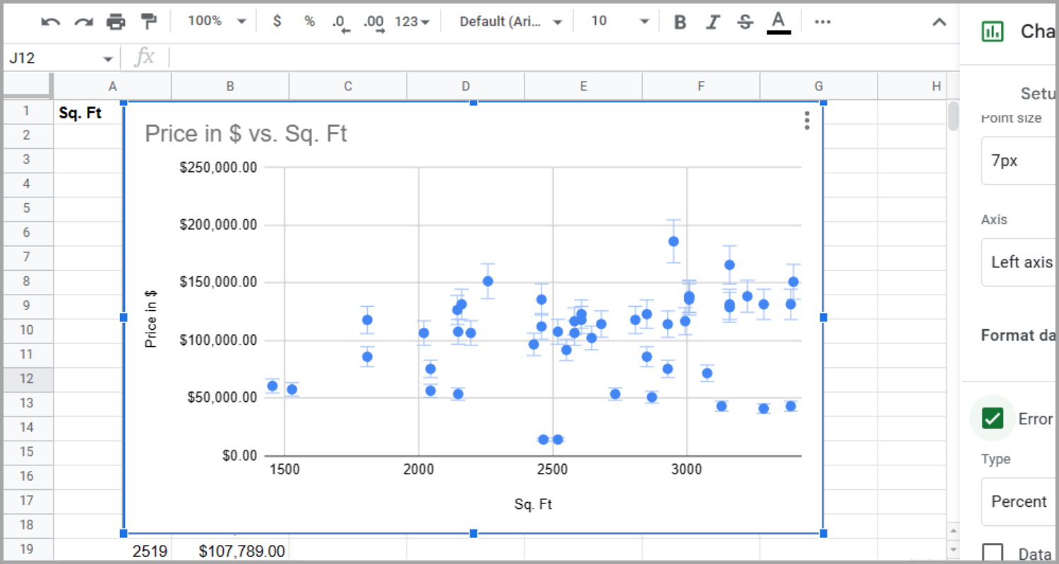
- Go to the “Customize” tab in the chart editor and expand the “Series” section. Now check the box next to “Error bars” to add error bars to your scatter plot.

- Now, error bars for each data point in your scatter plot graph, showing the degree of departure from the trendline, will be visible.

Data Interpretation with a Scatter Plot Chart
Let’s analyze the information presented in the scatter plot with trendlines and error bars to gain insights from the data.
The dataset contains two prominent clusters, each measuring about 2,000 sq. for $125,000 and approximately 2,500 sq. ft. for about $125,000 as well.
This suggests that there is only a small increase in cost for properties with slightly larger square footage and the properties in these clusters are priced similarly to each other.

As opposed to bar and line charts, a scatter plot graph is more effective in highlighting clusters within the data.


Furthermore, scatter plots are quite effective at displaying data clusters that deviate from the trend. Through the use of oversized error bars and being much above the trend line in our example, the chart argues that several of the larger properties are overvalued.

By following the instructions outlined in this guide, you will be able to quickly create and enhance scatter plots in Google Sheets. It’s worth noting.
However, scatter plots may not be the best choice for every type of data. If your trendline is flat or your error bars are large, it may indicate that your data does not have a clear trend.
I hope this tutorial on creating scatter plots in Google Sheets was helpful.


