Creating Pie Charts in Google SheetsA Step-by-Step Guide


Pie charts are useful for showing relationships between data and effectively conveying ideas with minimal words.
Despite some individuals’ hesitation to use pie charts in the presentation of reports and dashboards, they are widely accepted as a more effective way when it comes to data visualization.
Pie charts have become an effective and valuable tool for businesses and individuals. The challenge lies in knowing how to create one.
We are here to guide you to make a pie chart using Google Sheets – a free software option.
Creating a Pie Chart in Google Sheets: A Step-by-Step Guide
Note that pie charts are utilized to compare components within a larger category.
As a demonstration, we will create a hypothetical budget and compare its costs.
Our Pie Chart illustrates the breakdown of our weekly budget among different categories such as food, car, rent, utilities, and student loan payments.
Here is the data to use for creating the pie chart:
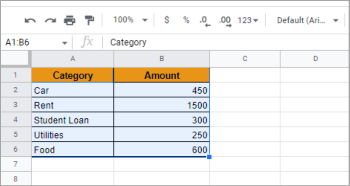
A pie chart with two columns is shown here, but any cell data can be used for this purpose.
Here is the Guide to Making a Pie Chart in Google Sheets:
- Highlight the cells with the data you need for the pie chart.
- From the top menu, select “Insert”.
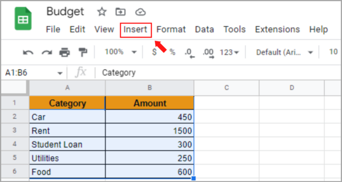

- Choose “Chart” from the options, but be careful not to click on a blank cell and unintentionally deselect the data.
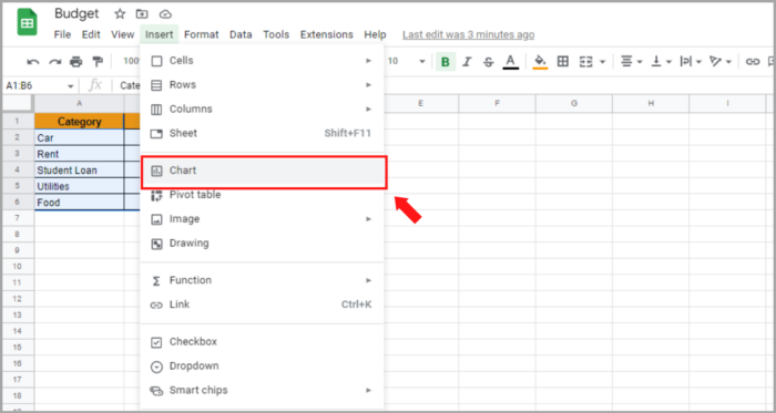
The steps mentioned above trigger Google Sheets to make assumptions and attempt to guess the desired chart type.
Fortunately, Google Sheets correctly assumed that we intend to create a pie chart. The data remains selected and next to it, a large pie chart appears.
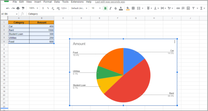
The picture above shows the default chart generated after clicking ‘Chart’ with the data selected.
It displays each category in a different color, labeled with a leader, and titled ‘Amount.’
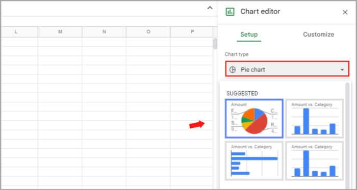
What if Google Sheets doesn’t correctly guess the chart type or do you need to change it? You have multiple options:
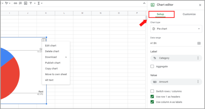
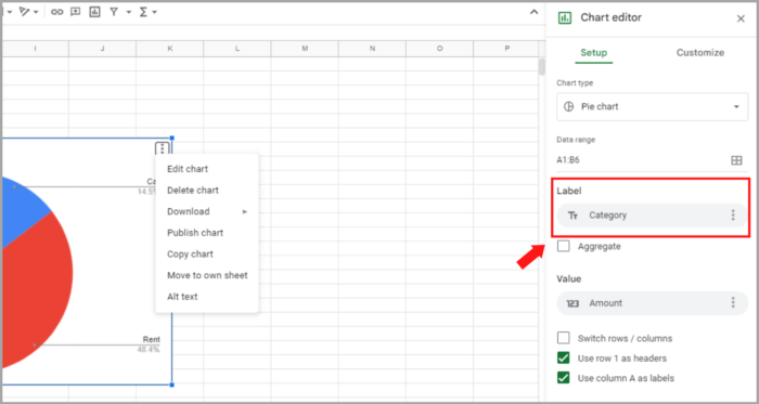
Left-click the chart to highlight the entire area in blue and access three dots in the top right corner. Clicking the three dots presents you with options.

You can edit the chart by selecting “Edit chart” from the options which open the Chart Editor on the right side.
If your default chart isn’t a pie chart, this can be changed by selecting “Chart Type” in the Setup tab. Scroll to find the “Pie Chart” among options such as Area, Column, Line, and Bar. Clicking “Pie Chart” converts the chart if necessary.
Easily customize the default pie chart after insertion to fit your needs.
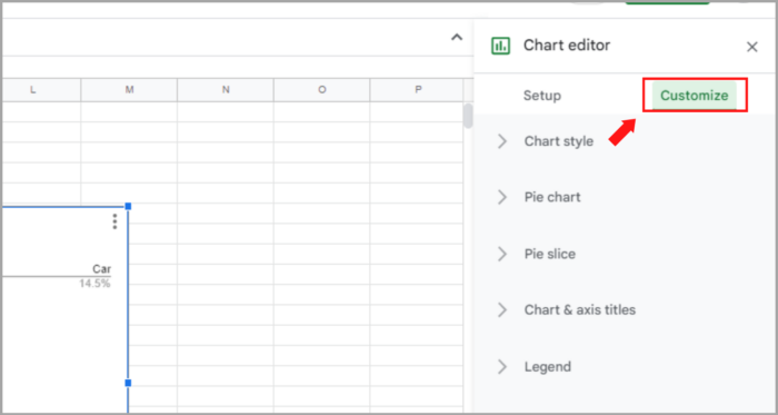
Customizing the Pie Chart
Good news! You have the ability to customize and make changes to your Google Sheets pie chart if it doesn’t meet your desired output. Let’s explore the editing options available.
To begin customizing your pie chart, left-click it and select “Edit chart” from the options menu at the top right corner of the chart and click on the three dots.

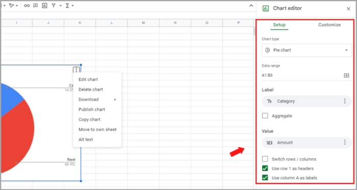
This opens the Chart Editor on the right with options that look similar to this.
Modifying the Data Set
To change the data range in a pie chart, click on the box next to “Data Range” to open a box.
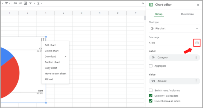
You can easily change the data range used in your pie chart. Simply click on the box next to “Data Range,” and select a new range by either highlighting the cells in the workbook or typing the range manually.
This will automatically update the pie chart.
Modifying the Label on the Pie Chart
The option to change the label can also be found in the same menu.
You can change the label of the pie chart in the Chart Editor menu.
In case your data range has different labels than the ones being used in the chart, you can change it from there.
Improving the Appearance of a Pie Chart in Google Sheets
Customize the appearance of your pie chart by adjusting colors, making it 3D, adding a legend, editing titles and labels, and even adding a donut hole.
This customization option can be found in the same Chart Editor menu, by clicking on “Customize”.
Revising the Visuals of a Pie Chart in Google Sheets
By selecting the “Chart style” option, you can access a range of customization options.
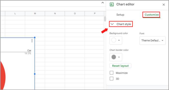
Under the “Chart style” option, you can adjust the following features of the chart:
- Adjust the background color of the pie chart.
- Customize the border color or remove it by selecting “none.”
- Alter the font style of the text.
There is an option to make the pie chart 3D, but it is not recommended because it can be misleading and difficult to interpret.
Customizing the Pie Chart Options
Clicking on “Pie Chart” in the customization menu will reveal a list of options to choose from.
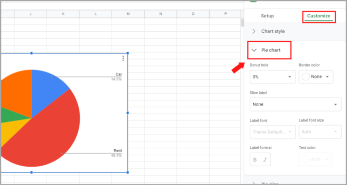
Here again, you will find some interesting customization options:
- Donut hole: This is where you can convert this pie chart into a donut chart. Just specify the value of the Donut hole, and it will add a hole with that much space taken off from the center of the pie chart.
- You can also change the border color of each slice using the ‘Border color‘ option.
- And then there is an option to add a label to each slice.
Adding Percentages to a Google Sheets Pie Chart
To add percentages to a pie chart in Google Sheets, go to the Customize tab in the Chart Editor and select Pie chart > Slice label > Percentage.
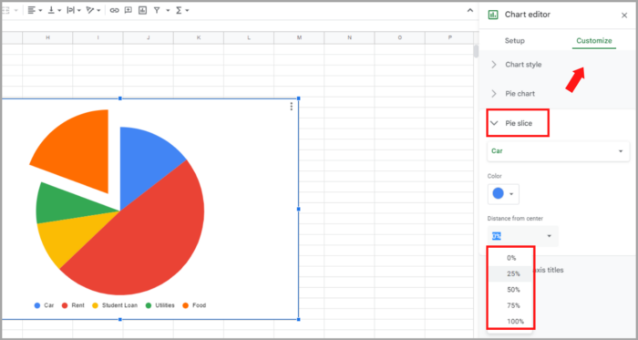
Modifying Pie Slices in a Pie Chart
You can make one pie slice stand out by causing it slightly protrudes outside the pie graph in the Pie chart.
You can also make one slice of the pie chart stand out by allowing it to slightly protrude outside the chart, as shown in the example where the car slice is made more prominent.

This can be accomplished through the Pie slice options in the Chart Editor.
Here’s the process:
- Access Customize tab in Chart Editor.
- Open Pie Slice options and reveal further options.
- Select the category to be highlighted from the drop-down.
- Adjust color for emphasis (optional).
- Choose or manually enter the distance from the center (e.g. 10%) for slice protrusion.
Exporting Pie Chart
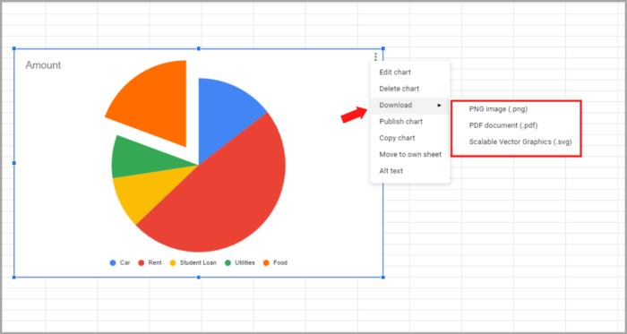
To save or export your chart:
- Open the chart’s 3-dot menu.
- Choose “Download”.
- Pick your preferred file format for downloading the chart.
Create a Double Pie Chart in Google Sheets
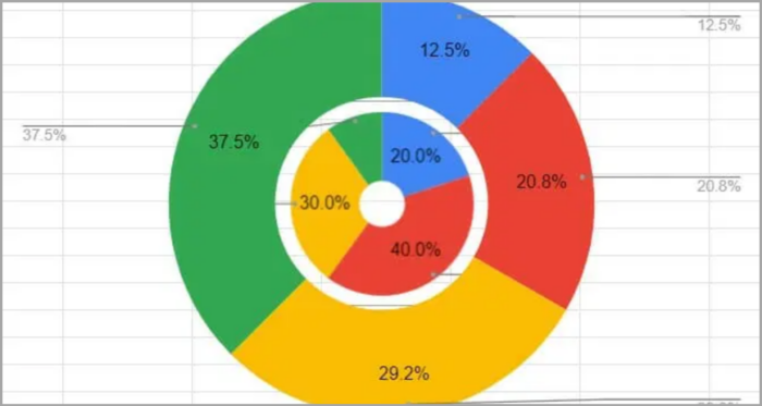
You can create a donut chart with a smaller size and place it inside another donut chart with a larger size. This gives a similar effect to a double pie chart. Here’s how you can make it:
- Go to Insert > Chart > Chart type and select Doughnut chart.
- Access the Customize tab.
- In Chart style, choose None for the Background color.
- From the Pie chart, select Doughnut hole 75%.
- Repeat for the second Doughnut chart, but set the hole to 25%.
- Resize the charts and place them together.
Making a Pie Chart on Google Sheets for iPhone and Android
Create a Pie Chart in Google Sheets on iPhone and Android:
- Highlight the cells for your chart.
- Tap Insert + > Chart.
- Tap Type.
- Tap the Pie chart.
- Tap Done.
I hope this helps you a lot!