Creating a Line Graph in Google SheetsLine Graphs are a Great Way to Display Data!

A line chart is a great way to display data that changes over time.
Using Google Sheets, creating a line graph is a simple process that can be easily customized to suit your needs.
Let’s delve into this topic right away!
Creating a Line Chart in Google Sheets
Begin by choosing the data you want to use by highlighting the range of cells with your cursor.
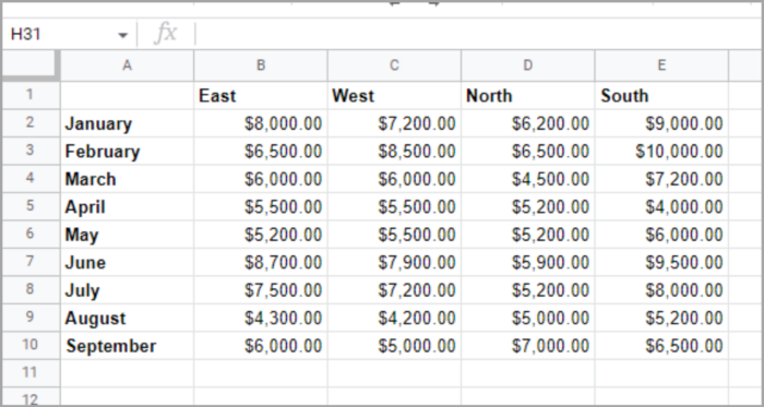
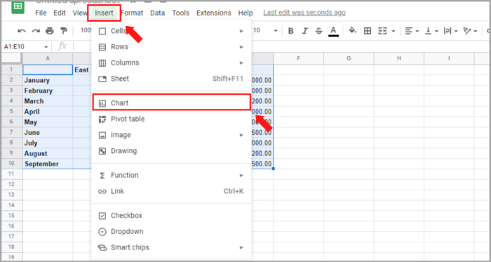
Navigate to the “Insert” menu, and select “Chart.”
By default, Google Sheets will insert a column chart into your spreadsheet. However, you can easily change the graph type.
Once the chart appears, the Chart Editor sidebar will also open.
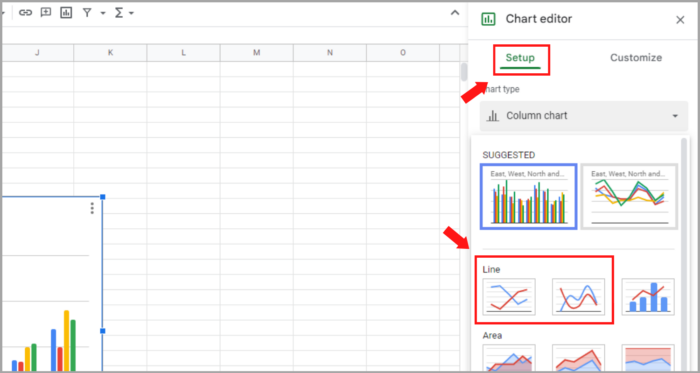
In the “Chart Editor” sidebar, select the “Setup” tab, and then choose the “Chart Type” drop-down menu.
Scroll down to the “Line” options and select your preferred line chart type such as “Standard” or “Smooth”.
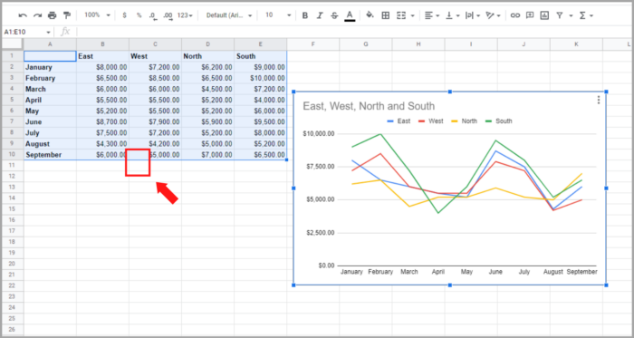
Once you have chosen the new chart type, the graph in your sheet will automatically update. You have the option to customize it to suit your preference.
Modifying a Line Graph in Google Sheets
Many of the chart types created in Google Sheets have similar customization options, such as altering the title, selecting a background color, or adding a border to the graph.
If you have closed the Chart Editor sidebar, you can reopen it by clicking the three dots on the top right of the chart and selecting “Edit Chart.”
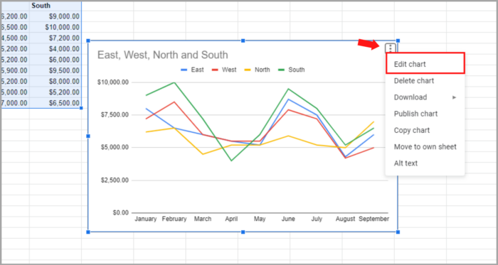
In the Chart Editor sidebar, choose the “Customize” tab at the top. This will display all the available options in a collapsed view, allowing you to expand and edit only the specific settings you need.

Let’s examine some options that are specific to line charts.
Series Adjusting
Each series on your chart is represented by a colored line. You can change the colors, adjust the thickness, or select a different line type for each series.
To do this, expand the “Series” section in the Chart Editor sidebar.
To customize each series individually, select the drop-down for “Apply to All Series” and choose the one you want to adjust first.
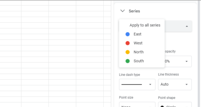
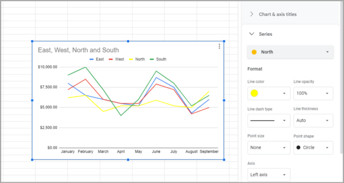
You have the option to change the color or select a point shape for that line. Any modifications you make will be reflected immediately on your line graph.
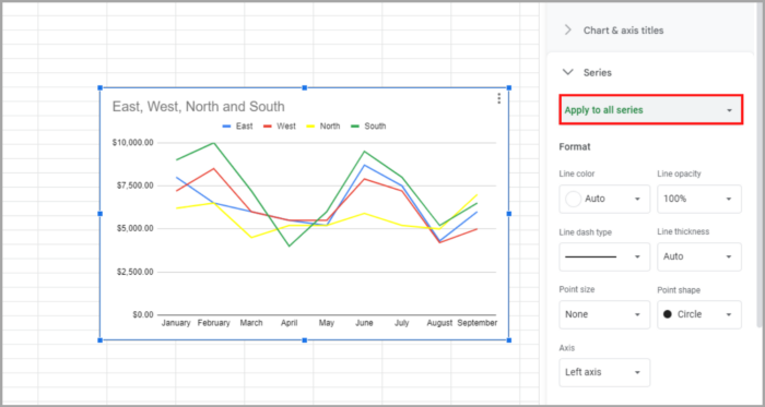
If you want to make a change that applies to all series, such as changing the line thickness, select “Apply to All Series” again and make your adjustments.
Modifying the Gridlines and Ticks
Another customization option for your line chart is the gridlines and ticks. You can access these options by expanding the corresponding section in the Chart Editor sidebar.
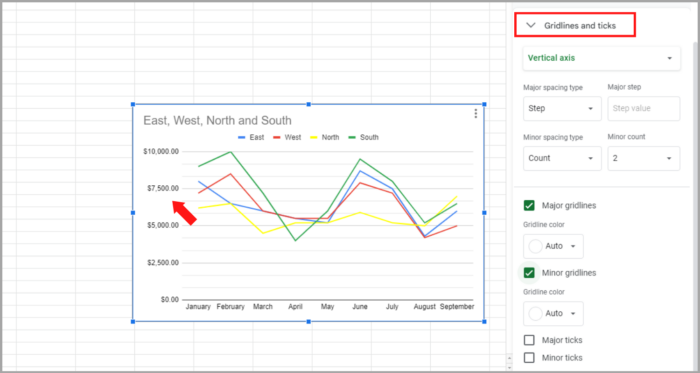
The horizontal axis only allows you to change the major ticks.
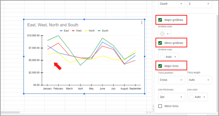
However, you can adjust both major and minor gridlines and ticks for the vertical axis.
You can select a different color for the gridlines and customize the position, length, thickness, and color of the ticks.
Legend Modifying
Modifying the legend of a line graph in Google Sheets is an additional step that can be taken to customize the chart.
Customize the position and appearance of the legend by expanding the “Legend” option in the sidebar.
You can adjust the position, font style, size, format, and color.
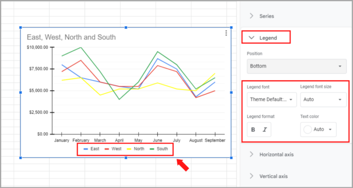
If you don’t want to have a legend on your line chart, you can remove it by selecting “None” from the Position drop-down list in the Legend section of the Chart Editor sidebar.

I hope this short article helps you a lot!
