How to Create a Waffle Chart in ExcelA Step-by-Step Guide with Screenshots & More!
Many individuals dislike using pie charts and have justified reasons for doing so.
If you share this sentiment, allow me to introduce the waffle chart, which is also known as the square pie chart.
This article will focus solely on the creation of Waffle Charts using Microsoft Excel.
An Overview of Excel Waffle Charts
Excel’s Waffle Chart is a collection of equal-area squares that illustrate the whole chart.
It operates based on percentages, where one square represents one percent of the entire value.
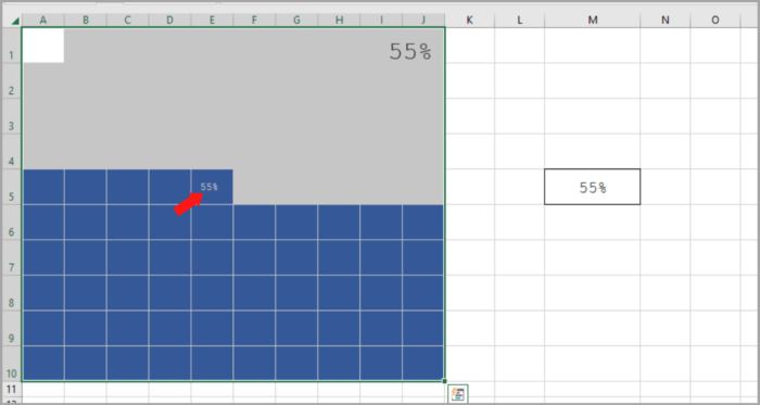
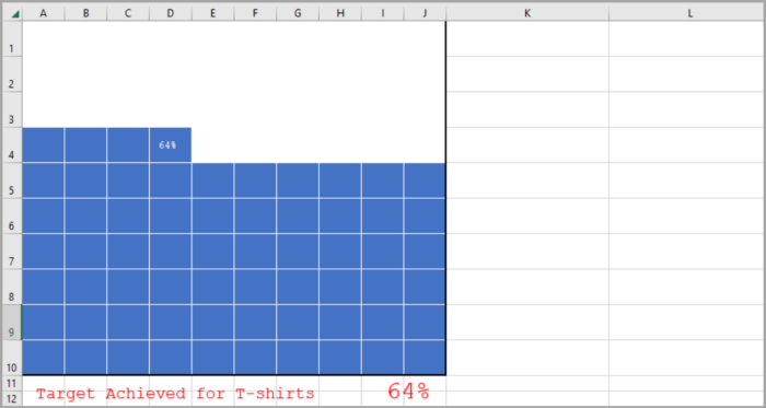
For instance, the image below is a demonstration of a waffle chart generated in Excel.
It consists of 100 squares, each symbolizing one percent of the total value.
Waffle Chart Components
Here are the Key Components of a Waffle Chart to Know Before Creating it in Excel:
- 100-Cell Grid: A 10 x 10 square grid made up of 100 cells.
- Data Point: A source of data to determine the percentage of completion or achievement.
- Data Label: A label to display the percentage of completion or achievement.
It is now time to learn how to create a Waffle Chart in Excel. Both static and dynamic options are available, depending on your needs. Let’s begin.
Step-by-Step Processes on how to Create a Waffle Chart in Excel
The Waffle Chart is not a default option in Excel, but rather an advanced chart that must be created manually.
Follow these steps to create a Waffle Chart in Excel:
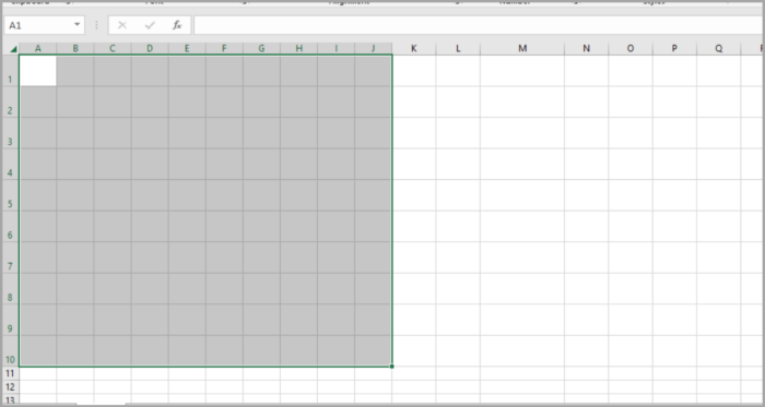
- Initially, you require a 10 x 10 grid of 100 cells, with uniform height and width. The overall grid must be square-shaped, hence the name “square pie chart.”

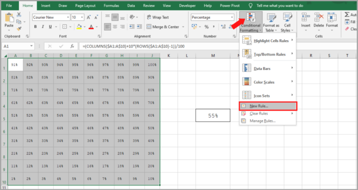
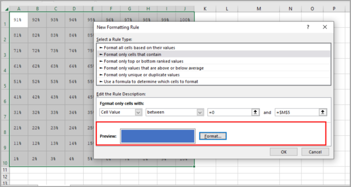
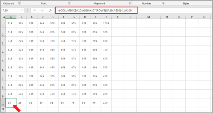
- Next, you must enter values ranging from 1% to 100% in the cells starting from the first cell of the last row of the grid. You can utilize the following formula to insert the percentages in the grid (simply edit the first cell of the last row, enter the formula, and then copy it to the entire grid):
=(COLUMNS($A10:A$10) + 10 * (ROWS($A10:A$10) – 1)) / 100 |
3. You will need a cell for the data point to record the percentage of completion or achievement. This cell must be linked to the waffle chart later on.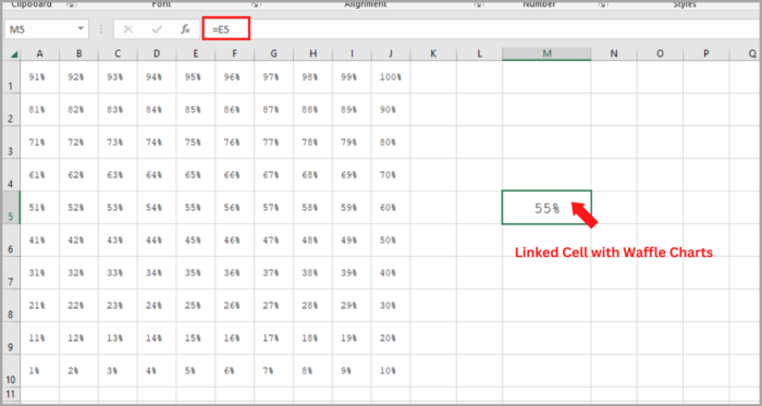
4. Once you have established the data point, the next step is to apply a conditional formatting rule to the grid. Follow these simple steps to apply the rule.
- Select the entire grid and go to Home Tab → Styles → Conditional Formatting → New Rule.

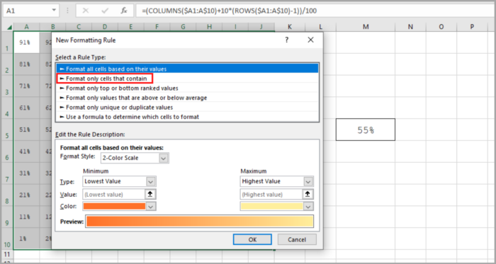
- In the New Rule window, select “Format only cells that contain”.

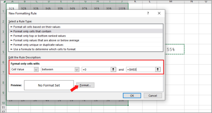
- Click the Format button to determine the format to apply.

- Make sure to apply the same color for font and cell color to hide fonts when conditional will apply.

- Select the entire grid and go to Home Tab → Styles → Conditional Formatting → New Rule.
5. From here, the final formatting touch must be applied. To do this, select the grid and follow the steps below:
- Make the font color white.
- Add a white border to the cells in the grid.
- Apply a solid outer border to the entire grid with a black color.
6. After following these steps, you will have a Waffle Chart linked to a cell, and when the data in that cell changes, the chart will be updated automatically.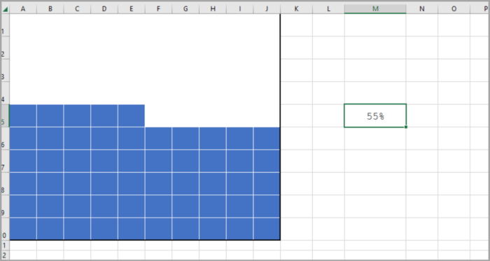
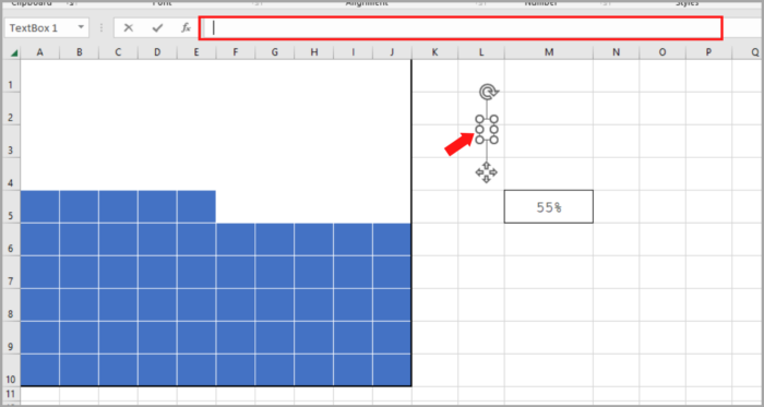
7. Now, to add a label to the chart, insert a text box and link it to the cell by following these steps.
- To insert a text box, go to the Insert tab, select Text, and then choose TextBox.
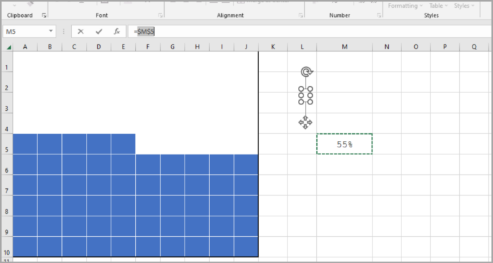
- Once the text box is inserted, select it and click inside the formula bar.

- Enter the reference of the cell containing the data point, and then press Enter.

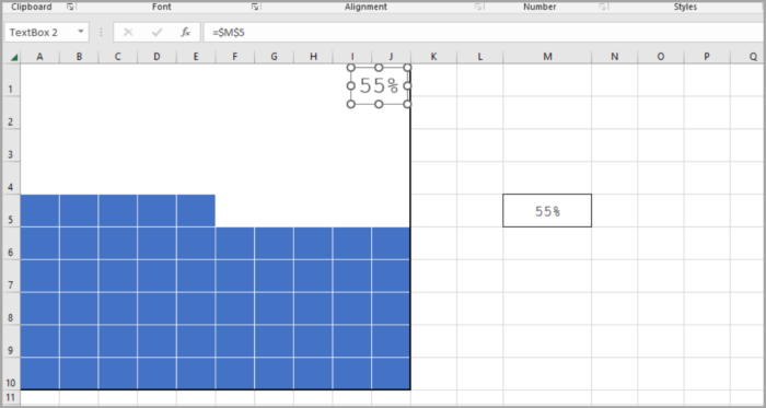
- Adjust the font size as desired and position the text box on your chart.

Now your Waffle Chart is complete, and you can use it wherever you like. But, I have one more suggestion to enhance its functionality. The chart below includes a small label in the last square of the grid, in addition to the main label, which can instantly inform the viewer of the chart’s value.

To include this label, these are the steps to follow:
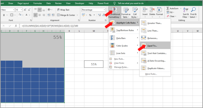
- First, select the entire chart grid and go to the “Highlight Cell Rules” option, then choose “Equals”.

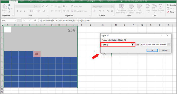
- Now, in the “Equals To” dialog box, in the “Format cells that equal to” option, select the cell containing the percentage value.

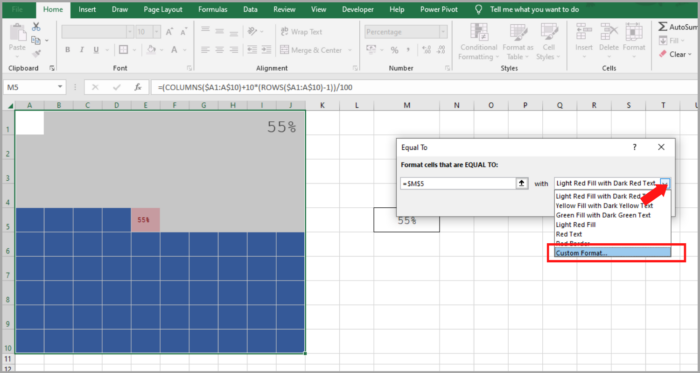
- Select the “Custom Formatting” option and navigate to the “Font” tab.

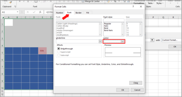
- In the font tab, choose “White” as the font color and confirm the selection by clicking OK.

Now, your Waffle chat is now ready.
Instructions for Making an Engaging Waffle Chart in Excel
Creating a WAFFLE chart is one step, but making it interactive adds a new dimension to it.
To make a chart interactive, it is important to have control over it, allowing changes in the data.
In this guide section, we will explore how to create an interactive WAFFLE chart using option buttons to change the data.
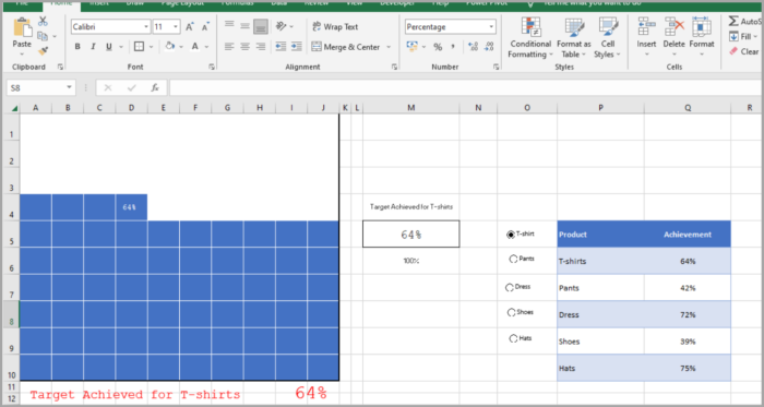
Let’s make an interactive Waffle chart.
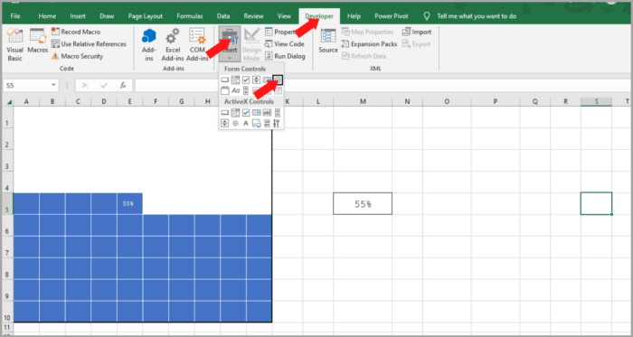
- To begin, insert five option buttons into the worksheet by going to the DEVELOPER Tab and selecting “Insert Option Buttons.”

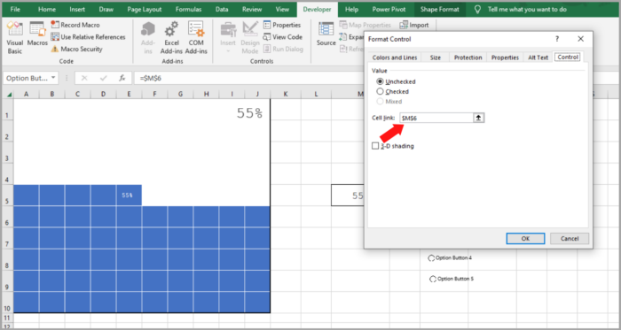
- Connect each of the option buttons to a cell, which will then hold a number representing the selected product.
- Select all of the option buttons, right-click, and choose “Format Control.” Alternatively, group the option buttons together by using the GROUP option.

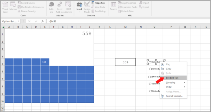
- Name each of the five option buttons according to the product names you have, by right-clicking and editing the text.

- Create a formula and insert it into the achievement cell, which will return the value for the selected product when an option button is selected.
- The formula for this is as follows:
| =INDEX(R6:R10,P3) |
7. Input the above formula into the achievement cell, where R6:R10 is the range containing the achievement values and P3 is the cell connected to the option buttons. 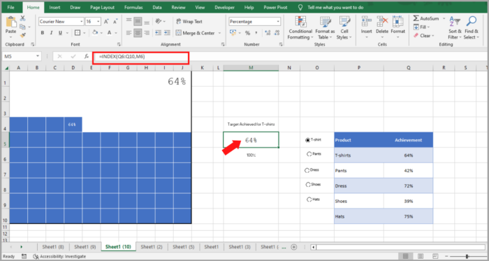
8. To make the chart more dynamic, create a dynamic label for the chart. Currently, the data label is connected to the achievement cell, but we need to make it dynamic.
9. Add the following formula to the cell next to the achievement cell.
| =”Target Achieved for “&INDEX(Q6:Q10,P3) |
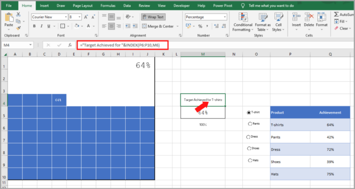
10. Insert a simple text box, and connect it to the cell containing the formula by selecting the text box and clicking in the formula bar, and typing the address of the cell where the formula is located.
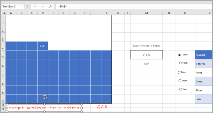
Now, you have successfully created an interactive chart in your worksheet that you can control using option buttons.
And if you want to make changes to the data in the future, simply insert a new option button and revise the data range in the formulas.
Create a Dashboard with a Waffle Chart
To incorporate the WAFFLE chart in a dashboard, you can use Excel’s Camera Tool or paste a special option to create a linked image.
This method offers the advantage of being able to adjust the size of the chart.
- Highlight the chart grid.
- Copy the cells using the keyboard shortcut Control + C.
- Navigate to the dashboard sheet and use the keyboard shortcut Alt-H-V-I or access the Home Tab, Clipboard, and select Paste as Linked Image.
Pros
- It provides a succinct overview of the project’s progress or target attainment.
- Its appearance is appealing and it can be incorporated into your dashboard with ease.
- You can effectively convey your message to the user without additional elaboration.
Cons
- Incorporating multiple data points into a waffle chart makes it complicated.
- Creating a waffle chart takes a few minutes.
- The data in a waffle chart can only be presented as a percentage.
Conclusion
A waffle chart is simple to create, visually appealing, and easily comprehended by the user.
It is ideal for tracking a key performance indicator (KPI) that is crucial to your business.
If multiple KPIs need to be monitored, then the interactive version can be employed.
I hope this article helps you a lot!

