How To Add a Secondary Axis in Excel ChartsStep by Step Instructions with Screenshots


Microsoft Excel makes it easy to store data as well as visualize it through tables and charts.
One of the most popular charts for users is charts with an X and Y axis layout.
However, one issue that often comes up when these charts are used is when there are two points of comparison included on the same charts.
In most cases, these points of comparison will use the same unit of measure in similar proportions, which can make it possible to perform a comparison.
However, when different units of measurement are used, or numbers become far off from each other, confusion can arise.
This is where a secondary axis comes in. A secondary axis adds a considerable amount of versatility to a chart allowing more points of data to be represented and plotted on a single chart.
With a secondary axis, it is possible to plot data points that are represented in different measurements or with a different scale.
Fortunately, Excel makes this extremely easy to do, and here we will show you how.
But first, let’s take a look at when a secondary axis may be needed.
When Is a Secondary Axis Needed?
Perhaps the best way to understand when you would need to use a secondary axis is with an example.
Consider a company that has the following earnings and margins over a ten-year period.
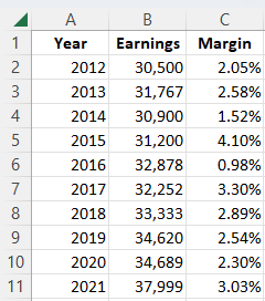
In order to see how these compare, we choose to place these data points on a chart with a blue line representing earnings and a yellow line representing margins.

Unfortunately, with only one Y axis, we can clearly see that earnings have increased, but it is impossible to determine whether the company has gained or lost profit margin because the two data series do not use the same measurement.
Though this chart may still be useful for analyzing changes in earnings, it is useless for determining changes in the margin.
With a secondary axis, however, this may change.

Now that we have added a secondary axis, we can tell how margins have changed alongside earnings.
This adds an entire level of depth to the chart and allows us to see that despite relatively consistent growth in earnings, the company’s profit margins have fluctuated considerably over the same period.
The same principles would often apply if we listed profit margin in dollar values as well due to the significant gap in magnitude that normally exists between this value and earnings.
So, now that you have seen how a secondary axis can help let’s see how you can add a secondary axis to your own charts.
How To Add a Secondary Axis with Recommended Charts
With every version of Excel since 2013, users have had access to the recommended charts feature right on their ribbon.
This feature will analyze your data and provide you with options that Excel thinks would best represent your data.
In most cases, like our example above, assuming your data is not overly complex, chances are Excel will include a chart that already comes with a secondary axis included.
One of the best parts about this is that Excel will generally input the units of measurement, format, and values for you so that you don’t have to. This can be a real time saver over inputting this data manually.
So, here is how you can use recommended charts to add a secondary axis.
- Select all of the cells in your dataset.
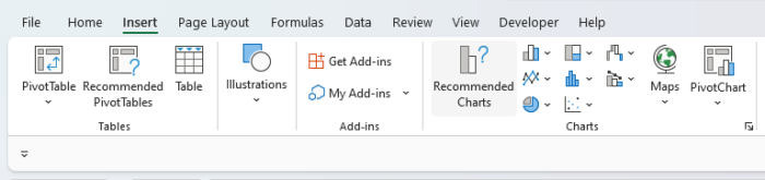
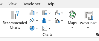
- Navigate to the “Insert” tab on your ribbon and select “Recommended Charts” from the “Charts” group.
- This will open the “Insert Chart” dialog box with a selection of charts that Excel thinks will best represent your data. Look at the options on the left-hand side of the dialog box for one with a secondary axis.

- Once you have identified a good option, select it to gain a better look at the preview, and if you are satisfied, select “OK.”
Generally, Recommended Charts will provide a wide range of options, so you can find something that will fit.
A great part about using this approach is that since you don’t have to manually input all of your data, it is extremely easy to change your mind and replace existing charts without any hassle.
The same applies when it comes to swapping out existing charts in your workbooks to add new ones with a secondary axis rather than adding another axis manually.
However, though Excel tries its best to provide relevant options, it is not always on the mark.
When this occurs, or you are using an older version of Excel that lacks the Recommended Chart feature, you will need to add a secondary axis manually.
So, let’s see how you can add a secondary axis to your charts manually.
How To Manually Add a Secondary Axis to an Excel Chart
If the above method of using Excel’s Recommended Chart feature doesn’t work for you, then you can always still add it manually.
This is still relatively easy to do, particularly if you already have your data set otherwise established in an existing chart.
Simply follow these steps to add a secondary axis to your chart:
- If you have not already selected your data set, navigate to the “Insert” tab, and within the “Charts” group, select one of the available chart options to have Excel insert your data into a chart.
- Within your selected chart, select the line, column, or other point associated with your secondary data series. If it is too small to be selected on its own, just select the blue selection lines around it instead.
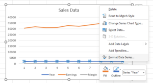
- With the second data series selected right, click and select the option “Format Data Series.” This will open the “Format Data Series” side panel.
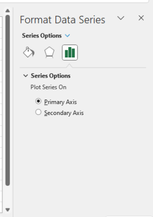
- In the side panel, select “Secondary Axis.” This will add a secondary axis to your chart, giving it a second bar. This is likely to add considerable clarity to your chart already, and based upon its interpretation of your data, Excel will attempt to provide some guesses as to the intended scale.
- Just like the primary axis, this secondary axis can be modified in many ways, including text alignment and direction. You can also give it a unique label and format.
It is easy to add a secondary axis with this same method, whether it is vertical or horizontal, and this is bound to be a significant improvement already.
However, you are certainly not stuck with your first choice of chart.
If you are not satisfied with your first pick and would like to change, this is extremely easy to do, and your secondary axis should already be added.
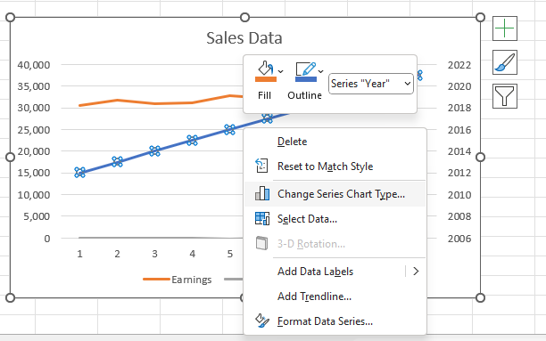
To make additional changes to your chart type, you can right-click on the second bar, and on the list of options, select “Change Series Chart Type.”
From here, you can select any type of chart you would like with a second point.
You can also right-click the secondary data series on your chart and select “Format Data Series” in order to make changes to the formatting of the data series. In many cases, making simple changes, such as changing colors to stand out, can make a chart far easier to understand.
How To Remove a Secondary Axis
A secondary axis can easily be removed once it is added. All it takes to delete a secondary axis is to select it and then hit the delete key on your keyboard or right-click it and select the delete option.
Then if you choose to, you can add a secondary axis again by following the steps above.
Conclusion
As you have seen, a secondary axis can be a valuable addition to Excel charts in many cases in order to allow users to better understand and visualize data.
A secondary axis can easily be added by using the recommended charts feature on the ribbon.
However, when this is not an option, it can also easily be added manually through the above method.