Easy Methods for Creating an Org Chart in ExcelTutorials with Screenshots
Creating an Organizational chart or an Org Chart is one of the best ways to organize information within an Organizational group.
SmartArt feature is an application in Microsoft (Excel, Word, and PowerPoint). Here you will find the different org charts in this feature.
We will tackle in this tutorial how to create an Org chart in Microsoft Excel. Editing and layout will also be tackled as well as how to create a visually appealing chart.
Org Chart (Organization Chart) Meaning
An Organization Chart is an illustration that is helpful in the visualization of relationships between individuals or groups of employees within a company.
By using an Org Chart, we will understand the organizational positions of the employees, such as:
- The flow of information from one employee to another.
- The flow of command in the organization.
- Employees’ scope of work.
- Employees report to whom in the organization.
The position in the org chart is symbolized by using rows of ‘Nodes’ (boxes), with each level of position present. This is like a pyramid structure.
In every position, there is a line created in the org chart between the different levels of the positions of individuals.
Org Chart Usage
The org chart is used to symbolize the positional structure of a certain group or individual. It has another application besides the illustration of the structure of individuals or groups.
Tracking of workload is an application of the org chart – this lets you see the work of each individual. Using this, you will see who is an overworked or underworked employee.
In planning a work schedule or workload, you can use an org chart to prepare the activities of employees in this scenario.
This also helps new employees see how they can properly contribute to the workflow of the organization, and to what department they belong.
Creating an Org Chart in Microsoft Excel
You can easily create different kinds of illustrations or diagrams by using the SmartArt feature in Excel.
Pyramids, block lists, cycles, and many more formats are available in this feature.
Using this layout, you can easily plan any techniques like positions, interactions, a chain of events, and many more.
The SmartArt has 15 position layouts offered, and the Organization Charts is the most commonly used.
How to Create an Organization Chart in Excel from a Clean Sheet
Let us assume that we want to create this Organization chart in Excel from scratch:
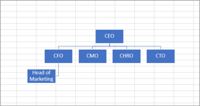
We can see how the position is aligned and which employee is in charge in the diagram shown above.
Here are the simple steps in creating an Org chart:
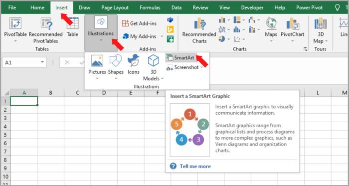
- Go to the Insert tab, and select the SmartArt button (Illustrations).

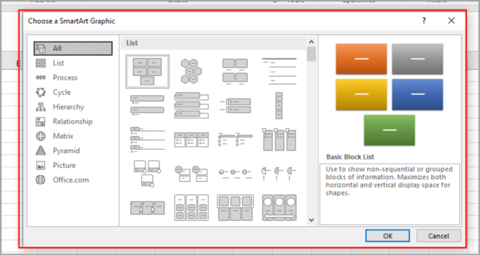
- SmartArt Graphic will open in a window.

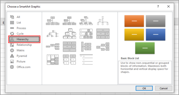
- Click on the Hierarchy (left side of the window).

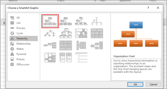
- On the right side of the window, click the Organization Chart icon from the list of layouts available.

- Click the OK button.
The Org chart will appear, and you can start editing.
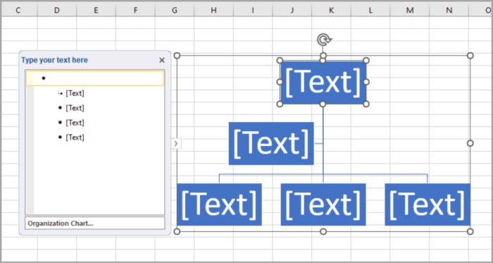
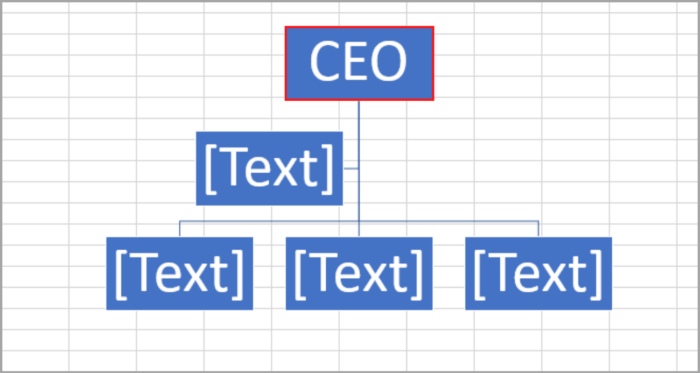
In editing the name or title, just simply click on the inside of the box.
The cursor will blink inside the box, and then you can now start typing the name or the title you want to show. In our example, we are using ‘CEO’ as a title in the box. You can see it in the image below:
If you don’t need the box or node from the chart that appears, just simply click on the box you want to remove.
And then, press the Delete key from your keyboard.
You can see the result that we deleted the node below:
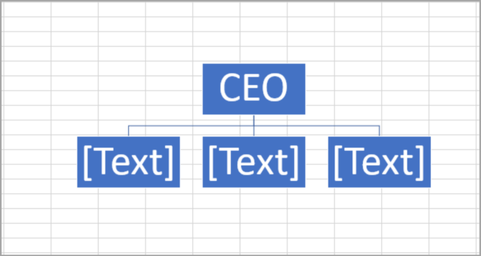
You can see the chart has 3 nodes directly under the CEO.
Let us now enter the name or title in the 3 nodes under the CEO:
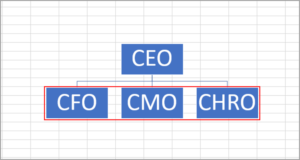
Besides the 3 nodes, we want to add a node with the title of ‘CTO’.
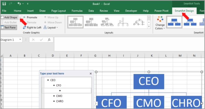
In adding a node, just select a node. In our example, we will choose the ‘CHRO’ node.
Then, go to the ‘Design’ tab (located in the SmartArt tool), and click on ‘Add Shape’. Shown in the image below:
A drop-down menu will appear, click on ‘Add Shape After.
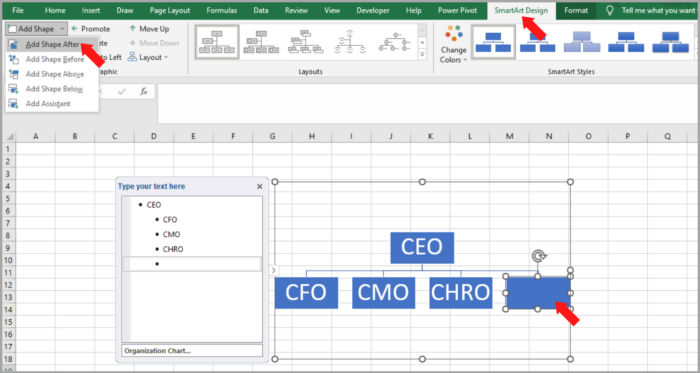
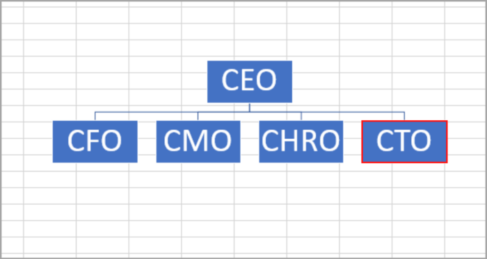
Now, another node will appear beside the ‘CHRO’ node. Just simply type the title, in our case, we will type the ‘CTO’ title in the new node.
And lastly, we want to add a node that is ‘Sales Team’ under the ‘Sales’ node.
Click on the existing node that you want to add under it. Go to the ‘Design’ tab, then ‘Add Shape’.
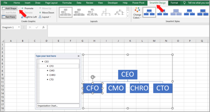
A drop-down menu will appear, click on ‘Add Assistant’.
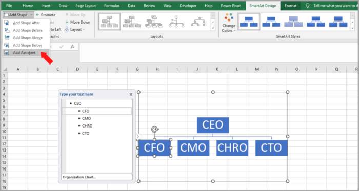
A new node will appear under ‘CFO’. Now, type the title you want to appear inside the node. In our case, we will type ‘Head of Marketing’. The image below shows the updated chart.

After you are finished with your org chart, you can now individually resize it to your liking. You can also move the node by dragging the nodes to your liking.
In this tutorial, we will tackle how to arrange an org chart in a distinct section.
How to Create an Org Chart in Excel (from a List)
If you are given a complicated org chart to create, it would be easy to create a list of names or titles and then use the Org chart’s Text Pane to edit.
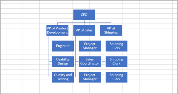
Here is our given sample for this problem:
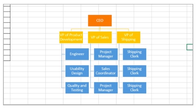
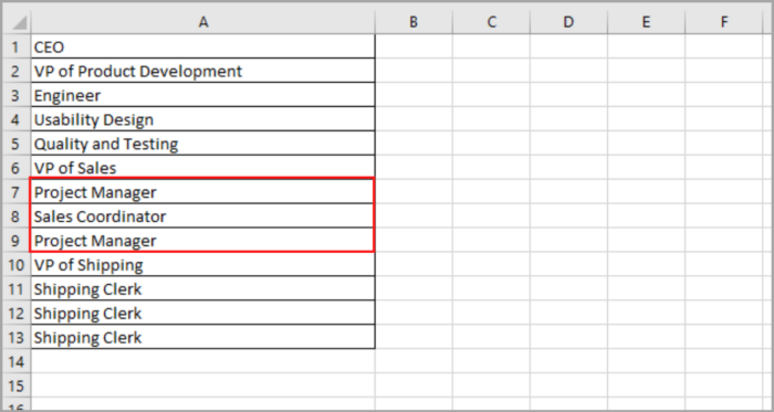
In this scenario, we need to list down the names or titles for your chart located in a separate cell. The image below shows the list:
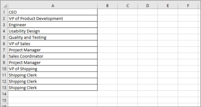
We must arrange the title according to their hierarchy. The below title will report to the above title.
For our example, the VP of Product Development has the Engineer, Usability Design, and Quality and Testing report to him. That’s why we added these three below the VP of Product Development in the list above.
If the list is finished, we now are ready to create the Org chart, navigate to Insert>SmartArt> Hierarchy>Organization Chart.
This window should pop out to your screen as shown below:
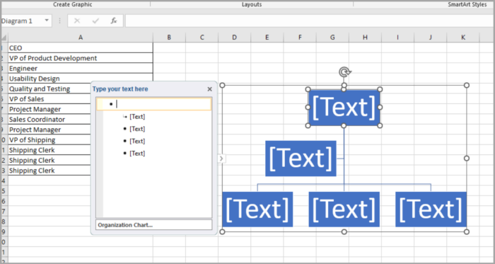
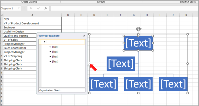
Click the litter arrow located at the left side of the Org Chart, if you cannot see the Text Pane.
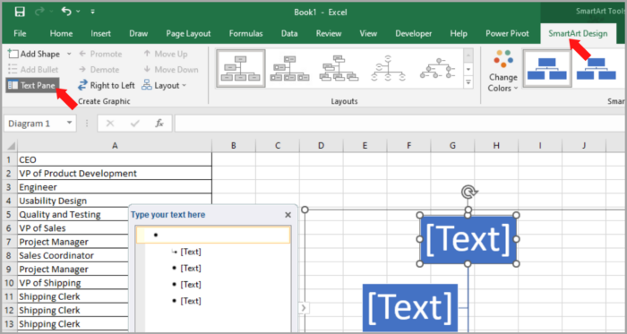
Or you just simply go to the ‘Design’ tab and click on ‘Text Pane’.
By pressing the Backspace button on your keyboard, you can delete the default bullet displayed in the Text Pane. Just click and delete it.
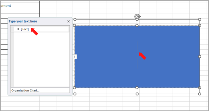
As you can see, all the nodes are deleted, and you are left with a single bullet in the Text Pane (One large node).
Select and copy the list of titles that you created, click/select the first bullet point in the Text Pane, and Paste the copied list. You can use the keyboard shortcut by pressing CRTL+V.
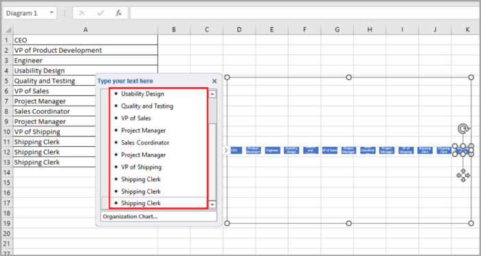
You can now see the titles of your list displayed in different nodes in a single hierarchy level of your Org Chart.
Method 1
Click each node and demote them. Just Go to Design>Demote, as you can see in the image below.
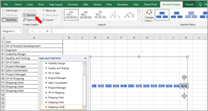
Keep on demoting each node until you reach your desired result. (Until they are under their respective managers)
For our example. We Click the ‘Engineer’ node and demote it once.
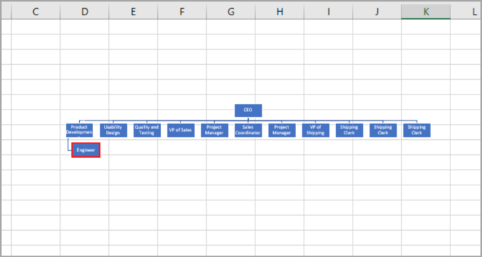
Just keep doing this until you reach your desired order of nodes.
Method 2:
In your Text Pane, used indent.
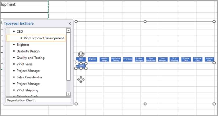
The CEO is one level below the VP positions, just click on the bullet point of CEO, and on your keyboard press the ‘tab’ button once to perform indent.
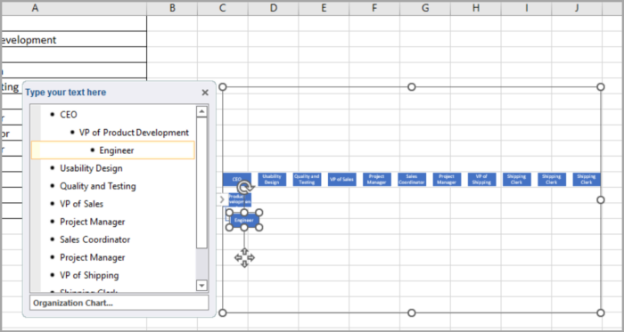
For the Engineer, it is one level below the VP of Product Development and two levels below the CEO. So click the Engineer and press the ‘tab’ twice.
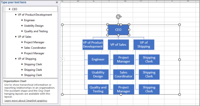
Just keep on indenting until you reach your desired result.
Here is the finished Org Chart in your Text Pane, the image below shows the organized bullet:
After you are done creating your org chart, you can now close the Text Pane.
How to Format the Org Chart
At this point, your structural Org chart is now done. You can customize it to whatever you want.
You may edit how it looks by editing the font (style, size, and color).
The background of the block, shapes, outline color and text effect can also be edited to your liking.
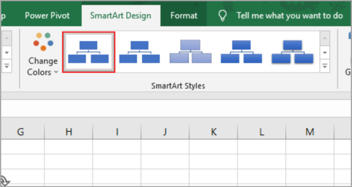
There are also available presets available in the SmartArt Styles group to easily design your org chart.
Here, you can use the design 3D effect, a metallic effect, a brick effect, etc.
The SmartArt has a feature where you can change the colors according to their hierarchy/position.
By using this feature, the viewers can easily differentiate between each block according to their hierarchy.
For our example, the illustration shows the different colors depending on the level of the hierarchy/position.
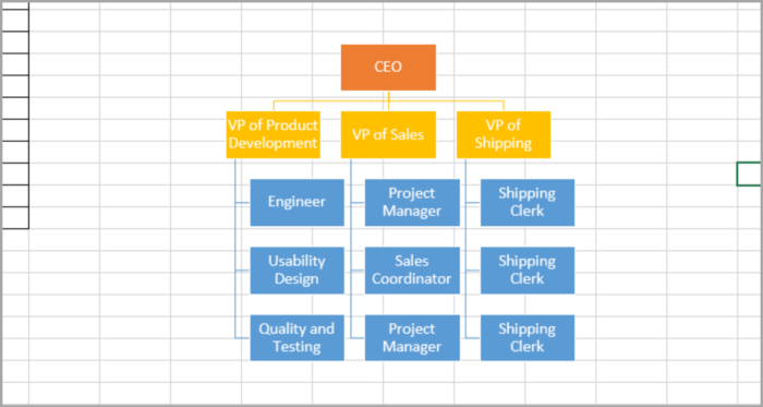
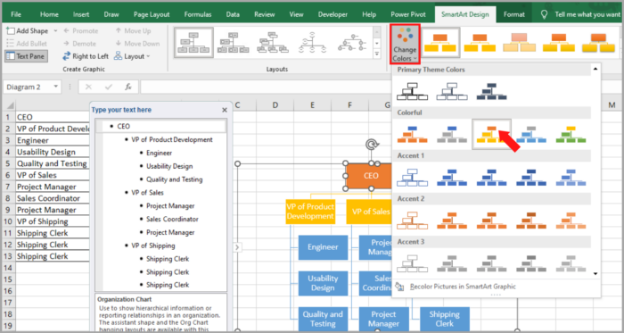
To have an effect like this, just simply go to the ‘Design’ tab, and select the ‘Colors’ dropdown (located in the SmartArt Styles group).
You can now choose the color that you want to apply to your created org chart.
How to Promote and Demote Nodes
After you finished your org chart, you can always edit it if you missed out on something or if there are changes in the existing chart.
For example, one employee gets promoted (Marketing Coordinator) and he now directly reports to the CEO.
To use promote, simply click the selected node and go to Design>Promote.
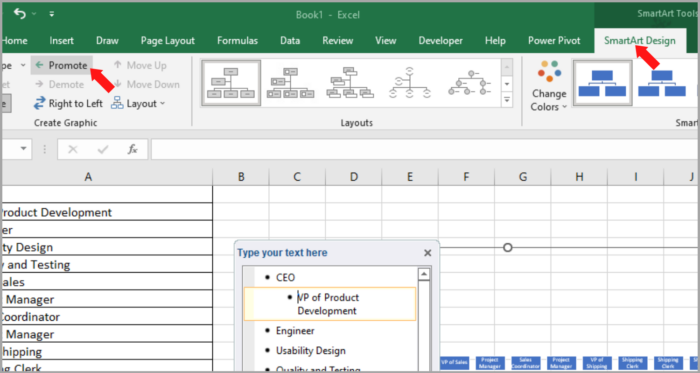
Now the Project Manager is promoted. Here is the updated chart:
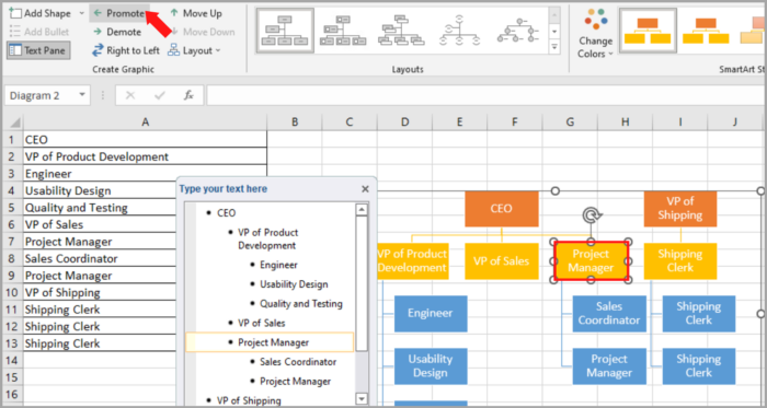
To use demote, go to Design>Demote.
How to Change the Order of Nodes
Changing the order of nodes can easily be done on the same hierarchy level.
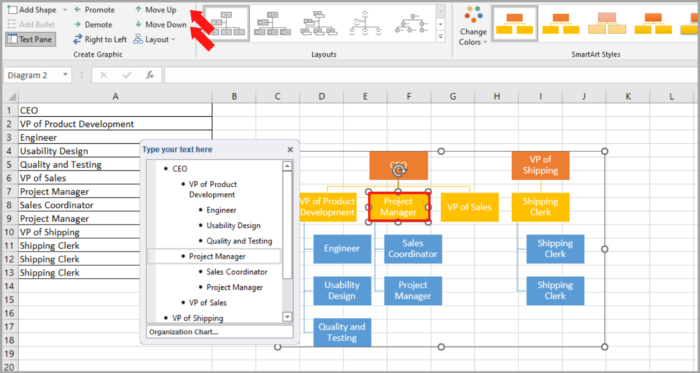
If you want to move a certain node, you can just simply go to Design>Move Up/Move Down until you reach your desired result or position.
For our example, we want to move the Project Manager to the Right side of the VP of Product Development. Just simply move the Project Manager node up once.
To change the orientation of levels, reverse the direction form, Right>Left to Left>Right, then go to Design>Right to Left.
Now, here is the updated org chart:
How to Change the Layout of the Org Chart
There are different layouts to choose from for your org chart.
You can see the different layouts in the ‘Choose a SmartArt Graphic’ window.
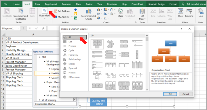
If you are not satisfied with the design that you have selected, you can easily choose another layout.
Just select your Org Chart, then go to the ‘Design’ tab and select the diagram you want from the ‘Layouts’ group.
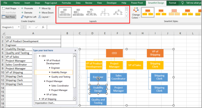
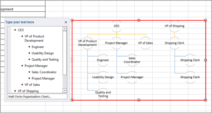
In this example, the Org charts’ design is a simple Box. This can be easily changed to a Half Circle Design by selecting the design in the Layouts.
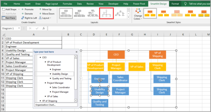
With the finished Org Chart, the image below shows the updated layout using the Half Circle Design:
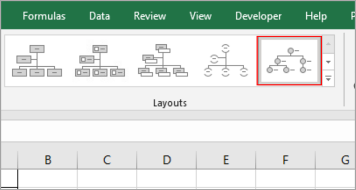
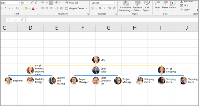
You can also add pictures of the people in the Org chart by selecting the ‘Picture Organization Chart’ or Circle Picture chart.
This effect is interactive and gives a lot of information to the viewers. It can make your Org Chart more visually pleasing to those who are looking at it.
Conclusion
An Org chart can help present the structural management of a certain company or group, and can easily present the hierarchy of the people within it.
This also helps to initially introduce the staff, employees, and team members of that company.
This tutorial has shown you how you can create an Org chart from scratch and how you can format, edit and design it.
We hope this tutorial helped you.

