How To Create a Heat Map in ExcelA Step By Step Guide


A heat map is a tool to allow users to quickly and easily compare data visually within a dataset based on their respective values.
It does this by assigning unique colors to data based on the values within a given cell.
This is a great way to analyze a large amount of data at once because it means that users can gain an idea of the data within different cells, rows, and columns without needing to spend the time to read and compare them manually.
Given that Microsoft Excel is designed to present data, it makes sense that users would benefit from having a way to present data with a heat map.
Unfortunately, among the many types of graphs and tables that it can create, Excel does not have a built-in way to create a heat map.
However, there is a quick and easy workaround you can use to create heat maps, and we will show you how to do it step by step.
What Is a Heat Map?
Before we get started, it may help to better understand what a heat map is and how it can help to quickly understand and interpret data.
When you think of heat maps, it may make you think of weather forecasts you have seen on TV, and you would not be too far off in concept.
A heat map is a graphical representation of data that uses a color-coded system to represent and visualize results within a data set.
Often this color coding works on a hot-to-cold type color scheme to distinguish between different values, just like you would see on a weather report.
The primary aim of this is to help users quickly understand and visualize the relative value of a given result within a data set in relation to the whole and direct them to the most important results quickly.
Because they use immediately visible colors to represent and communicate values, they can be easily used to display a general view of numeric values.
This is particularly valuable when dealing with a large volume of data, where color can be much easier to distinguish and make sense of than a numeric value alone.
In some cases, a heat map may be used to help understand other written data as well, including text or, in some cases, even literal hot and cold zones.
One point of particular value is how a heat map can be used to draw attention to trends in data.
For example, in website management, a heat map may be used to identify trends in user interest by identifying the topics users are most interested in by the number of unique visits.
Though this is already an extremely useful and versatile tool, a heatmap also has the advantage that it is virtually self-explanatory.
Unlike other methods of data visualization, which must be explained, a heat map is typically as simple as the darker the shade of color, the greater the corresponding value.
Considering the large volumes of data that are often stored in an Excel worksheet with column after column and row after row of information, a simple way to visualize and compare information is particularly desirable.
This is where a heat map comes in.
Creating a Heat Map in Excel with Conditional Formatting
Now that you know what a heat map can offer you and that Excel does not offer any built-in means to add one, you may be thinking about coloring each cell individually.
However, this is not a good route to go, not only because it would be extremely time-consuming but because you would have to rego through and apply colors every time a value is changed.
Fortunately, there is a way you can create a heat map that is far less arduous, and this is with conditional formatting; here is how.
- Select all of the cells in your dataset.
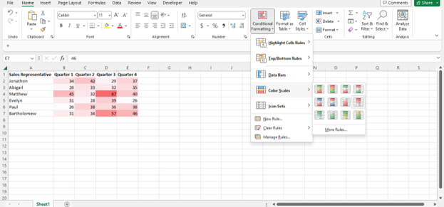
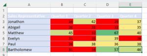
- Navigate to the “Home” tab and select “Conditional Formatting” from the “Styles” group. In the drop-down list that appears, select “Color Scales” and the color scale that you would prefer to use for your data. For example, “Red – White Color Scale.” You can see a preview of how the color scale will appear on your data set by hovering your mouse over each option.
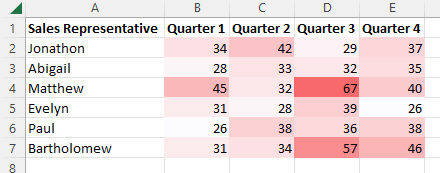
- As you can see, with this color scale, Excel will assign red to the highest value by default and white to the lowest value. Between these two extremes, it will assign a color based on the values within the cell. This means that there is a gradient with shades of these two colors which will be assigned based on value.
Suppose all you want is a simple heat map with Excel’s predefined color gradients, then you are already done.
However, what if you would prefer no color gradients and instead you would like to simply highlight values that are lower than 35 in red, no matter their respective values?
This is easy to do as well, with only a few minor changes to the process.
Just follow these steps:
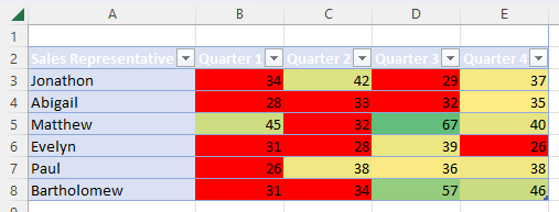
- Navigate to home and select “Conditional Formatting,” “Color Scales,” and “More Rules.”
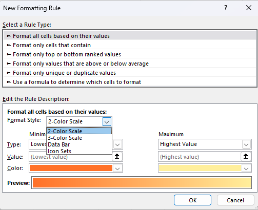
- This will bring up the “New Formatting Rule” dialog box where you can set advanced formatting rules. Make sure in the “Select a Rule Type” menu that “Format all cells based on their values” is selected, and in the “Format Style” box, select “3-Color Scale.”
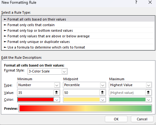
- Now you can set the minimum, maximum, and if you chose “3-Color-Scale” midpoint values and their assigned colors. In our example, we wanted to highlight cells below 35 in red. So, under the “Type” option, we will select “Number,” under “Color,” we will select a shade of red, and then “OK.”

- With our selected options, this will give us a heat map in which all of the values below 35 are highlighted in red. Using the same “New Formatting Rule” tool, we could set similar thresholds for the midpoint and maximum point if we wanted.
As you can see, conditional formatting is a powerful tool for creating heat maps and setting advanced formatting rules that will update with changes in data.
Keep in mind, though, that this means these settings are volatile, which means that they will be recalculated every time certain changes are made in the worksheet.
For a particularly large data set, this can result in your spreadsheet slowing down as the conditional formatting is recalculated over and over again.
For a small amount of data or users with powerful devices, this can be okay.
Otherwise, it may result in considerable difficulty working with these spreadsheets
Format an Excel Heat Map as a Table
Though an Excel heat map is a powerful tool and is already dynamic since it automatically updates to account for changes in cell value and updates colors accordingly, however, when new rows of data are entered, it will not update to add conditional formatting to the new data.
In order to make an Excel heat map update to account for new rows of data, we can instead format it as a table.
This is extremely easy to do. Simply select all of the cells in your heatmap, header rows included, and click “Ctrl+T” on your keyboard.
This will automatically format your heat map as a table. Alternatively, select all of the data in your heat map, navigate to the “Insert” tab, and select “Table.”
Once formatted as a table, your heat map will update automatically when new rows of data are entered.
How To Create an Excel Heat Map Without the Numbers
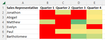
In some cases, you may want users to be able to view the relative results without becoming distracted by the numerical data.
However, doing this is not as easy as simply deleting the cell values because Excel needs these in order to calculate the resulting colors for the heat map, which means erasing the values would also erase the heat map.
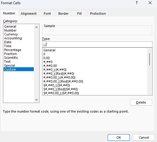
You can, however, instruct Excel to hide the numbers by setting custom formatting. To do this, select all of the cells in your heat map and press “Ctrl + 1.”
This will open the Format Cells dialog box. Here look to the Number tab, select Custom, and input “;;;” in the “Type” box.
Select “OK,” and Excel should now display your heat map without the numerical values.
How To Create a Heat Map in an Excel PivotTable
Making a heat map in an Excel pivot table is essentially the same process as for a normal data set.
This means that you will use a conditional formatting color scale, and it will work the same way as it did for normal data above.

However, there is one difference, and this is that when data is added to the source table in the back end, Excel will not apply the conditional formatting to the new data automatically.
Even when the table is refreshed, conditional formatting will not be applied to the new data, and it will instead show up blank.
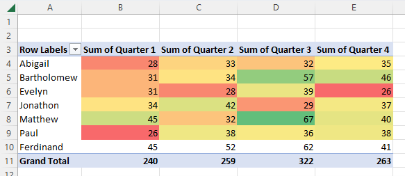
In order to fix this and update the pivot table so that the conditional formatting will be applied to the newly inputted entries, it will take a few extra steps.
Here is how to do this.
- Select the cells within the existing heat map.
- Navigate to the “Home” tab and within the “Styles” group, select “Conditional Formatting” and “Manage Rules.”
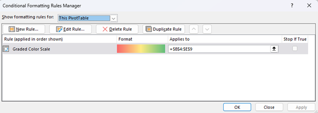
- This will open the “Conditional Formatting Rules Manager” dialog box.
- Here, select your existing rule and the “Edit Rule” button.

- This will, in turn, open the “Edit Formatting Rule” box, where you will make changes under the “Apply Rule To” options to change the parameters of the conditional formatting. You can either update the “Selected Cells” in order to apply it to the newly inputted cells or select either of the other two options starting with “All Cells showing” to add dynamic formatting to your table. In the latter case, Excel will update the heat map for the pivot table whenever new data is added.

- When you are finished, select “OK,” and the conditional formatting will be updated, and your heat map should now extend to the newly inputted data.
Conclusion
Now you have seen the value of adding a heat map to your data sets in Excel, as well as how to add a heat map using conditional formatting in only a few simple steps.
Further, you have learned how to make a heat map truly dynamic and how it can be added to the pivot table and updated when necessary.
Like all operations in Excel, it is helpful to practice it a few times on a practice sheet before applying these techniques to an important data set to avoid losing any critical information.
However, once you have gotten the hang of it, this process is extremely easy to apply to any data set you have.