How To Make a Bell Curve in ExcelStep-by-step Guide


When it comes to analyzing data, a bell curve is one of the most common statistical tools.
The bell curve allows analysts to graph data with a normal distribution, which, when plotted, looks like a bell giving this curve its distinctive name.
In Excel, where data analytics is a core application, this type of curve comes in heavy use.
From financial analysis to education, many users from all walks of life question how to make a bell curve in Excel.
Fortunately, Microsoft makes this relatively easy.
Here we will walk you through the whole process of creating a bell curve in Excel and show you more about this incredible tool and how you can use it to help with data analysis.
So, let’s get started.
What Is a Bell Curve?
A bell curve, or normal distribution, is a common variety of distribution for a variable.
With this type of distribution, data points occur most frequently in a symmetrical manner around the mean.
The term “bell curve” is a reference to the unique symmetrical curve it forms once plotted in which the two legs of the curve create a mirror image across a vertical line.
In order to understand what a bell curve is, it is important to be aware of the two metrics that define it. This includes:
- Mean: Mean is the average in any set of values and can be found with simple arithmetic by dividing the sum of all the values by the number of values in the set. This represents the average value of all the data points in a data set, and once plotted, it can be found at the top of any bell curve.
- Standard Deviation: Standard deviation is how much the data points in a given set differ from the mean value of the data. This is calculated as the square root of the variance, and once graphed, this value defines the width of the bell curve. A low standard deviation indicates that data points are close to the mean of the set, and correspondingly the bell curve will be narrow. In contrast, a high standard deviation indicates that the data points are spread out over a greater range, and the bell curve will, in turn, be wide.
The highest point of the bell curve for any set of data represents the most probable outcome, which with this type of distribution, includes the median, mean, and mode.
All of the other potential outcomes are symmetrically distributed around the curve on the downward-sloping curves on either side of the curve’s peak.
Using the standard deviation, which, as described above, is the measurement that is used to quantify the data dispersion in the specific values of the data set around the mean, it is easy to analyze the data because certain facts will always be true.
For instance:
- A bell curve will only have one mode that coincides with the mean and the median and lies at the highest point of the curve.
- Precisely, 68% of the data will be within one standard deviation of the mean;
- Precisely 95% of the data will fall within two standard deviations of the mean; and
- Precisely, 99.7% of the data will be within three standard deviations of the mean.
Any data points that fall further out than three standard deviations from the mean will be extreme outliers from the average values of the data points.
Why Would You Use a Bell Curve?
Bell curves have a wide range of applications, from analyzing and predicting returns on investments to relative grading in education and competitive employee appraisal systems.
Bell curves help to determine how data is distributed once it is plotted on a graph, and so long as it is evenly distributed, it will always result in a symmetrical bell-shaped curve.
For financial analysts and investors, a bell curve can be used to analyze the returns of a security, market sensitivity, future stock prices, rates of growth for future earnings, potential default rates, and other crucial phenomena.
Perhaps most notably, by using a normal probability distribution, an analyst or investor can make assumptions pertaining to a security’s probable future returns.
This can assist in decision-making both to reduce risks and boost returns in a given portfolio.
However, before using a bell curve in making an analysis, it is important to determine whether the data in question is normally distributed.
In some cases, this will not be the case, and using a bell curve to model results, can result in an inaccurate model.
For educators, “grading on the curve” is a classic way to grade quizzes and exams by comparing students’ relative performances.
Consider an educator that wants to compare students’ performances on a test. If everyone on the test scored well, simply grading by how many answers were correctly answered may not be enough to show who scored better or worse.
In order to do this, converting students’ scores into percentiles and graphing can allow for a quick and easy way to differentiate performance.
For example, if everyone got above a 90, it would allow a teacher to compare those who got a 91 and those who got a 99.
Students who got lower than the mean scores will be on the left of the bell curve, those who scored higher than the mean will be on the right, and the majority of students will be within one standard deviation of the mean on top of the curve.
This will allow students to be easily graded according to their relative performance.
Finally, bell curves are often used in managerial decisions relating to employee performance.
By plotting employee performance on a bell curve, workers can be compared by their relative performances.
This means that no matter whether all of a company’s employees have incredibly high or low performances, they can be compared relative to each other.
This type of comparison can be useful when it comes to performance reviews or making other management decisions such as rewards or coaching.
Creating a Bell Curve in Excel
In order to show you how to create a bell curve in Excel, consider a teacher that needs to grade a student’s performance on an exam.
The first step to creating a bell curve would be to prepare the data by entering the students’ scores, sorting the data, and calculating the average and the standard deviation.
Preparing the Data

In order to find the mean, you can use Excel’s built-in “Average” function. To do this, simply enter =AVERAGE(Beginning Cell Reference, Ending Cell Reference), substituting your own cell references.

This will provide you with the mean, and now you will need to find the standard deviation. Again this can be done with one of Excel’s built-in functions. Excel will show two possible functions that can be used to find the standard deviation. This includes:
- “=STDEV.P” = This formula is to be used in a situation where you know you have data that is complete, basically a population.
- “=STDEV.S” = This formula can be used when you have data that is not complete, basically a population sample.
For those working with statistical analysis, “=STDEV.S” is often used as a tool to draw samples out of a data set. However, since our teacher is working with a complete set of data, “STDEV.P” is the better option. To use this, a blank cell is selected, and we enter the formula:
=STDEV.P(Beginning Cell Reference, Ending Cell Reference)
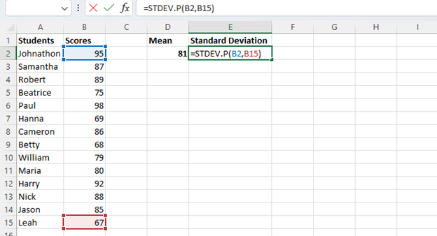
This will provide the standard deviation for the data group. Notably, in order for the graph to create a bell curve, you will need the data to be in ascending order. This is easily done simply by selecting your values, clicking the “Sort & Filter” command on the ribbon, and “Custom Sort” on the drop-down menu.

This will open the “Sort” menu box where you can select which column to sort by, in this case, “Scores.” In the “Sort On” menu box, make sure “Cell Values” is selected, and in “Order,” select “Smallest to Largest.”
Click “OK,” and Excel will sort your data from the smallest value to the largest.
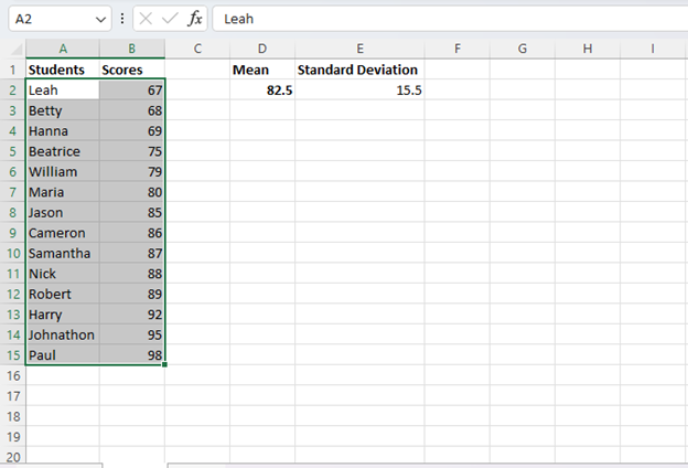
Now your data is ready for you to proceed.
The next step will be to find the normal distribution.
This can be accomplished with the “NORM-DIST” Function.
To use this, you will enter the following formula in a blank cell substituting the correct values.
=NORM.DIST(x, mean, standard_dev, cumulative)
In this formula, “x” represents the data point you wish to use to calculate the normal distribution, the mean and standard deviation represent the data you have already calculated, and cumulative represents the logical value that will specify what type of normal distribution will be calculated.
For the Cumulative Normal Distribution Formula, “TRUE” is entered, and for the Normal Probability Density Formula, which we will use, “FALSE” is entered.
To calculate normal distribution, enter the “=NORM.DIST(“ formula in an empty cell and begin entering the required values while separating them with commas.
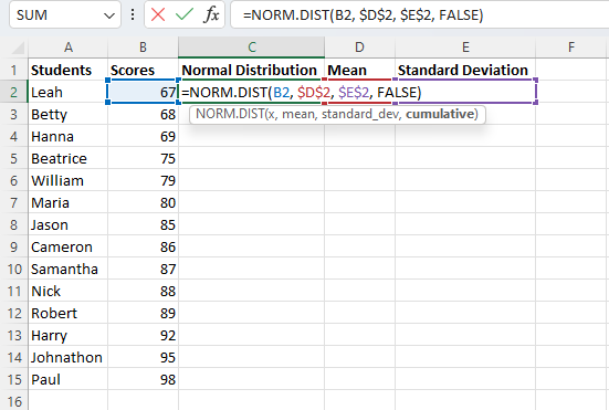
- For “x,” substitute the first cell reference in your column of values.
- For the mean, enter the cell reference for the mean you have already calculated. Then press “F4” on your keyboard to lock the cell reference so that it will not change when you copy the formula to calculate the normal distribution for other cells.
- For standard deviation, enter the cell reference where you already calculated this value and again press “F4.”
- For the cumulative logical value, enter “FALSE” to instruct Excel to give the value for the Normal Probability Density Formula. If you wanted to get the results for the cumulative normal distribution function, you would enter “TRUE.”
- Close the parentheses and press “Enter” to run the function, and Excel will generate the normal distribution for the first value.
- Simply select the “Fill Handle” and drag it down to have Excel calculate the results for the remaining values in your data set. Because the values for the mean and standard deviation were locked, these will remain constant while the value for the data point will change based on the row.

Now you have all of the data points and information you need to begin plotting your data.
Create a Scatter Plot
With all of your data ready, you can now begin using it to create a bell curve in Excel, and the first step for this is to create a scatter plot.
Fortunately, Excel makes this extremely easy to do. Simply follow these steps.
- Select the dataset (In this case, the student’s scores) and the normal distribution you calculated.

- Navigate to the “Insert” tab and select “Scatter with Smooth Lines.”
- This will instruct Excel to use your inputted information to generate a chart, which in this case, is your bell curve.

As you can see, the resulting curve may be more or less bell-shaped, and this is normal.
This occurs because the inputted information is not normally distributed, meaning the mean, median, and mode are not identical.
In practice, this will often occur when data such as student test scores or employee performance are inputted.
It will often become smoother and more bell-shaped when a larger data set is used.
However, regardless of how smooth and bell-shaped it is, the curve may still be useful for analysis and decision-making.
Adjusting the Chart
Now that you have your bell curve charted, you can make customizations to improve its appearance and make it better suit your particular needs.
First of all, you can change the title simply by double-clicking the default title and entering whatever title you would prefer.
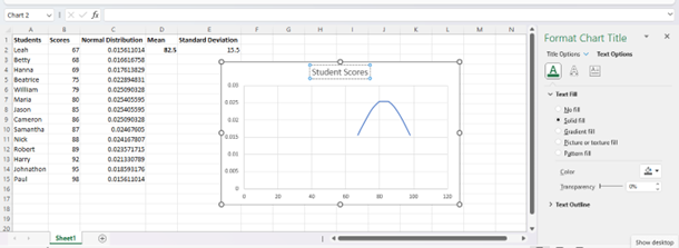
By selecting the “+” icon beside the chart, the arrow next to “Chart Tile,” and more options, you can open the “Format Chart Title” menu. This will give you the ability to fully customize the font type, size, positioning, and other appearance options for your chart’s title.
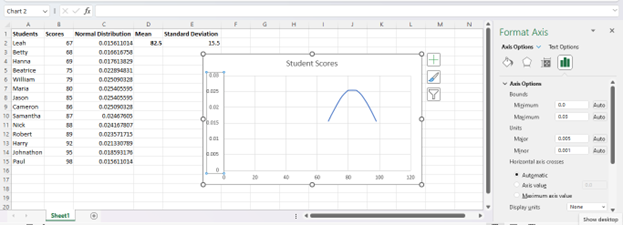
You can also select either the vertical or horizontal axis in order to open the “Axis Options” menu, where you can make changes to both the appearance and minimum and maximum values on your chart.
With these tools, you can give your bell curve a more professional appearance and help it to communicate data better.
Conclusion
Now you know what a bell curve is, how it can be used to help you in a wide range of applications, and how to create one in Excel.
By using the process you learned above, you can create a bell curve for any data set.
Using this bell curve, you can identify where a given data point lies on the curve and use this information to make informed judgments.
This can be a truly flexible tool for financial analysis, investment, and many more potential applications.